
In your pocket, you have a powerful tool!
Nowadays, everyone uses their phone to search, but is your website ready for them? In today’s fast-paced digital world, the importance of Mobile SEO cannot be overstated.
As smartphones become increasingly central to our daily lives, most internet users now access the web through mobile devices. This shift has transformed the Search Engine Generative (SGE) optimization landscape, making Mobile SEO a necessity and a pivotal component of any successful digital strategy.
SEO Agency will help you optimize your website to ensure it performs well on mobile devices, providing a seamless and engaging user experience.
The blog post will dive into the world of Mobile SEO and discover how to make your site the perfect mobile companion, boosting traffic and keeping users happy.
What is Mobile SEO?
Mobile SEO, or mobile search engine optimization, is a subset of SEO focusing on optimizing a website to ensure it performs well on mobile devices.
The overarching goal of Mobile SEO is to provide an optimal browsing experience for users accessing sites via smartphones and tablets. This involves designing websites to load quickly, display correctly on various screen sizes, and offer easy navigation tailored for touchscreens.
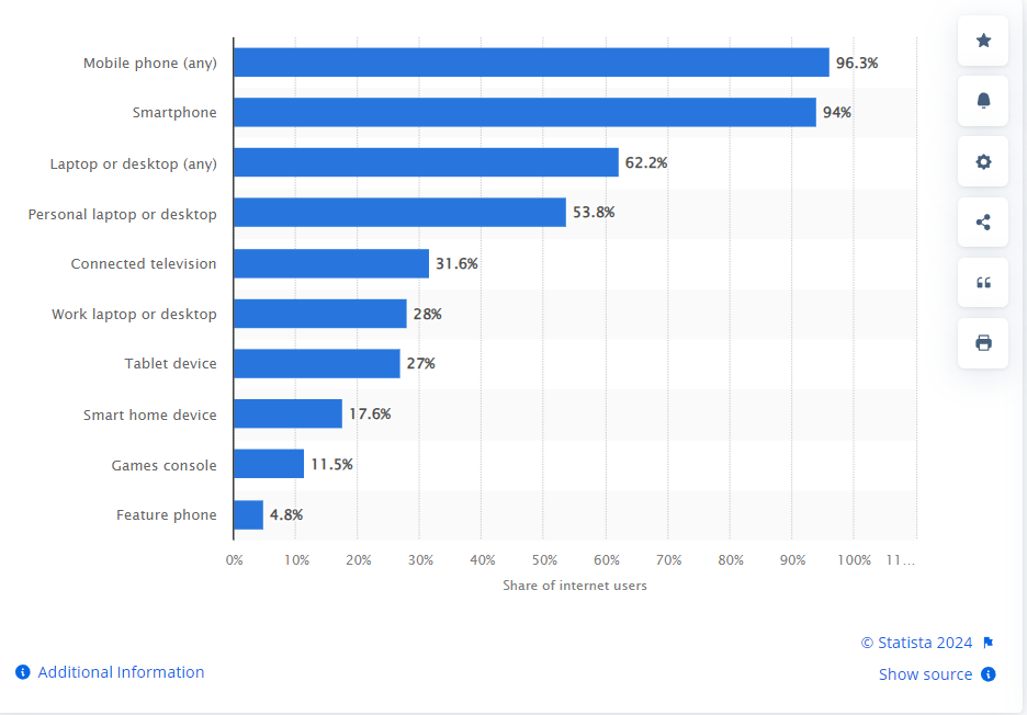
Source: Statista
Optimizing for mobile requires considering several factors, including the site’s structure, page speed, design, and content. It ensures all site features, such as forms and calls to action, work seamlessly on mobile devices.
A significant aspect of mobile SEO involves responsive design, which automatically adjusts the layout of a website to fit the screen size of the device it is being viewed on. This approach is favored by users and recommended by search engines as a key element of mobile optimization.
Advanced SEO strategies also play a crucial role in Mobile SEO. Programmatic SEO, for example, involves automating the creation of pages at scale based on user data, which can significantly boost a site’s visibility and performance on mobile searches.
Additionally, AI in SEO is used to enhance various mobile SEO strategies, such as optimizing content for voice search and improving personalization, which is becoming increasingly important as mobile usage grows.
Why is Mobile SEO Crucial in Today’s Digital Landscape?
The necessity of Mobile SEO can be attributed to several compelling reasons that underscore its importance in today’s digital landscape:
- Increasing Mobile Users: Mobile users have skyrocketed, with most global internet users now accessing the web via mobile devices. This shift from desktop to mobile browsing means that websites not optimized for mobile are likely to miss out on a significant portion of traffic.
- Google’s Mobile-First Indexing: E-E-A-T Google now predominantly uses the mobile version of the content for indexing and ranking. This approach, called mobile-first indexing, highlights the importance of mobile-optimized sites in achieving better SEO results.
Websites that provide a poor mobile experience could see a drop in their rankings, leading to decreased traffic and conversions. - User Experience and Engagement: Mobile users expect fast, convenient, and efficient browsing experiences. Sites that are difficult to navigate slow to load, or poorly formatted for mobile screens can lead to increased bounce rates and lost traffic.
Mobile SEO helps ensure visitors have a positive experience, leading to higher engagement rates and more time spent on the site. - Local SEO Enhancement: Mobile SEO is particularly crucial for local businesses. Mobile searches often have local intent, and many mobile users look for local information on the go. Optimizing for mobile can help businesses appear in local search results, which is vital for attracting local customers and driving foot traffic.
- Competitive Advantage: Many businesses are still slow to adopt mobile optimization, but a robust mobile SEO strategy can provide a significant competitive advantage.
Being mobile-friendly makes a site more appealing and accessible to mobile users, potentially increasing market share among this growing audience. - Voice Search Optimization: The rise of voice search has changed the SEO landscape, with more users now using voice commands to perform searches on their mobile devices. Mobile SEO needs to account for these changes by optimizing content to be more conversational and question-based, catering to how people naturally speak.
Designing for Mobile Usability
In the current digital era, designing for mobile usability is no longer optional; it’s imperative. As mobile devices dominate internet access worldwide, the focus on optimizing mobile experiences has intensified.
One of the most effective approaches to ensuring a website serves mobile users well is through Responsive Web Design (RWD).
Responsive Web Design (RWD)
Responsive Web Design is a design methodology aimed at creating websites that provide an optimal viewing experience—easy reading and navigation with minimal resizing, panning, and scrolling—across various devices, from desktop computer monitors to mobile phones. This approach responds to the needs of the users and the devices they’re using.
The layout changes based on the size and capabilities of the device. For instance, on the phone, users might see content shown in a single-column view; a tablet might show the same content in two columns.
Characteristics of Responsive Design
Responsive Web Design is characterized by several key features:
- Fluid Grids: A fluid grid layout uses relative sizing to fit the content to the device’s screen size. The layout of the website will adjust dynamically based on the screen size using CSS media queries, ensuring that the same HTML can serve all devices, whether desktop, tablet, or mobile.
- Flexible Images: Images in a responsive website are also sized in relative units, so they adjust harmoniously to the size of the screen. This prevents images from being displayed outside their contained element.
- Media Queries: Media queries allow the page to use different CSS style rules based on characteristics of the device the site is being displayed on, most commonly the width of the browser.
- Accessibility: RWD considers factors like readable font sizes, adequate space for interaction elements, and contrasting colors for readability, all of which are crucial for accessibility.
Benefits of Responsive Design for SEO
Responsive Web Design offers several SEO benefits that make it a preferred choice for optimizing mobile SEO:
- Improved Site Usability: Google has indicated that a site’s usability is a ranking factor. Responsive design, by making a website more accessible and navigable for users, indirectly affects the site’s ranking. This is because a positive user experience keeps people on the site longer, decreasing bounce rates and increasing page views.
- Enhanced Mobile SEO: With Google’s move to mobile-first indexing, having a mobile-friendly website is more important than ever. Responsive design means just one version of your site needs to be indexed and maintained, simplifying the SEO strategy and maintaining consistency in content across devices.
- Decreased Bounce Rate: Websites that are not optimized for mobile lead to a poor user experience and a significant increase in bounce rates. Responsive websites offer a much better user experience, which keeps users on the site longer.
- Increased Shareability: A responsive design makes it easier for users to share and link to your content with a single URL, thus enhancing link-building efforts from a mobile SEO perspective.
- No Risk of Duplicate Content: Creating a separate mobile site with RWD is unnecessary. This eliminates the possibility of Google penalizing sites with duplicate content.
- Boost in Local SEO: Responsive Web Design also plays a vital role in local SEO. Mobile users perform many local searches, and a mobile-friendly website enhances those opportunities. Integrating responsive design with local SEO practices like optimizing for “near me” searches can dramatically increase local traffic.
Responsive Web Design aligns perfectly with the principles of mobile SEO by ensuring that a site is functional, easy to navigate on any device, and optimized for the performance metrics that search engines care about.
As mobile continues to grow, the significance of RWD in SEO vs. SEM strategies is more critical than ever, influencing everything from user experience to how effectively a site can compete in international SEO markets.
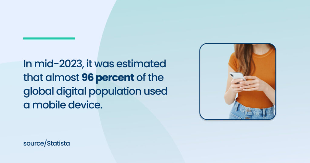
Source: Statista
Implementing RWD is a forward-thinking approach that not only meets the mobile demands of today but sets up a framework to handle the devices and user needs of the future.
Mobile-Friendly Layouts and Navigation
In the vast arena of mobile SEO, it is paramount to ensure that a website’s layout and navigation are mobile-friendly.

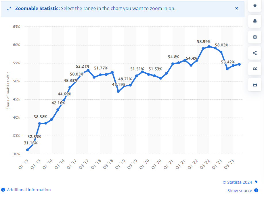
Source: Statista
As mobile traffic continues to outpace desktop usage, the design of mobile pages and their user experience can significantly influence SERP features and overall SEO success.
A mobile SEO strategy must prioritize ease of use, accommodating mobile devices’ smaller screens and touch-based interactions.
Simplifying Navigation for Smaller Screens
The challenge with mobile devices isn’t just their smaller screens but also how users interact with them. Navigation that works well on a desktop may become clunky and overly complex on a mobile device.
Therefore, simplifying navigation is crucial for enhancing the mobile user experience and boosting mobile search results.
- Prioritize Key Pages: Start by evaluating the site’s architecture from a mobile user’s perspective. Identify key pages most users want to access and make these easily reachable from the main navigation menu.
This might mean streamlining navigation menus to include only primary links, with secondary links accessible through additional menus or at the bottom of the page. - Hamburger Menus: One popular solution for mobile navigation is the hamburger menu, which consolidates all navigation links into a simple three-line icon.
This icon expands when tapped, saving space on the main screen while still providing access to the complete list of navigation options. This method keeps the interface clean without sacrificing user access to important sections of the site. - Sticky Navigation: Implementing sticky menu bars that remain accessible as users scroll can significantly enhance navigation. This feature is especially useful on mobile devices, where scrolling back to the top to access the menu can be cumbersome.
- Clear Categorization: If the site includes a complex array of products or content, clear categorization in the navigation menu is essential. Utilize drop-down or accordion menus that expand when tapped, allowing for deeper navigation without leaving the initial menu.
- Search Functionality: Including a prominent search bar within easy reach allows users to bypass navigation menus altogether, which can be particularly useful for e-commerce sites or content-heavy sites where users come looking for specific items or information.
Optimizing Touch Elements and Button Sizes
Touchscreen functionality has fundamentally changed how designers think about user interface elements. Buttons, links, and form fields must be designed with touch in mind, which includes considering their size, spacing, and responsiveness.
- Size and Spacing: The average adult finger pad size is about 10mm wide, which should guide the minimum size for interactive elements.
It is critical to ensure that buttons and links are large enough to be easily tapped without accidentally pressing nearby elements. Google recommends a minimum target size of 48 CSS pixels in height and width. - Responsive Feedback: To make a mobile site more intuitive, provide immediate visual or tactile feedback when pressing buttons. This could be a simple color change, animation, or a vibration.
Responsive feedback reassures the user that the system has registered their action, which is crucial on mobile devices where connections might be slower. - Spacing Between Elements: Along with sizing buttons adequately, it’s important to provide enough space between elements to prevent the frustration of mis-taps.
This includes spacing around icons, links within text, and form elements, which should all have sufficient padding to distinguish them from other touchable elements on the page. - Accessibility Considerations: When designing touch elements, it’s also vital to consider users with motor impairments or those using assistive technologies.
Accessibility features such as voice commands, screen readers, and alternative navigation options should be incorporated to ensure the site is usable for everyone.
Optimizing mobile layouts and navigation is not just about adhering to the best practices of mobile SEO services—it’s about anticipating the needs and behaviors of mobile users.
As mobile devices evolve, staying ahead of mobile SEO trends through tools like Google Search Console, SEO automation, and ongoing testing becomes essential. This ensures that your mobile experience remains efficient, enjoyable, and effective in driving mobile traffic and achieving high search rankings.
Local SEO for Mobile
In today’s hyper-connected world, the intersection of local SEO and mobile optimization is where businesses find significant opportunities for growth. Comparing on-page SEO vs. off-page SEO, you will find clear differences when deciding which one to apply.
As mobile usage continues to rise, tailoring your SEO strategy to cater to mobile visitors through local search optimizations is not just beneficial—it’s essential.
Integrating local SEO into your mobile strategy can enhance your visibility and drive more geographically-relevant traffic to your website.
Importance of Local SEO in Mobile Strategy
Local SEO’s importance in a mobile SEO strategy stems from users’ unique behavior, who often search for immediate and location-specific information.
Mobile searches with local intent are significantly higher than those on desktops, with users looking for everything from local dining spots to last-minute shopping destinations.
The immediacy of mobile devices means optimizing for local search can directly influence a business’s foot traffic, making local SEO a crucial element for success in mobile strategies.
- Higher Conversion Rates: Local searches on mobile devices have a higher intent to purchase, often leading to immediate action.
For instance, a user searching for “coffee shops near me” will likely visit a cafe shortly after conducting their search. This high conversion potential makes optimizing local SEO an essential strategy for businesses looking to capitalize on mobile traffic. - Increased Relevance and Personalization: Businesses can offer users more relevant content and promotions based on their geographical location by focusing on local SEO. This level of personalization enhances the user experience, increasing the likelihood of engagement and repeat visits.
- Integration with Mobile Technologies: Modern smartphones are equipped with GPS and other location-sensing technologies, allowing for precise user location tracking.
This capability enables businesses to push location-specific content and offers to potential customers, further enhancing the effectiveness of local SEO.
Optimizing for Local Search on Mobile
To effectively target local customers through mobile devices, businesses must implement specific strategies that align with how people use their smartphones for local searches.
This process involves several key practices:
Google My Business Optimization
Optimizing your Google My Business (GMB) listing is one of the most critical steps in local SEO for mobile.
A well-optimized GMB profile improves your chances of appearing in Google’s local search results and the local pack, which prominently displays business information at the top of the search results.
- Complete and Accurate Information: Ensure that every detail on your GMB listing is accurate, including your business name, address, phone number, and operating hours. Consistency across all your online profiles is key to boosting your local SEO.
- High-Quality Photos and Videos: Adding high-quality photos and videos can significantly improve user engagement with your listing.
Visuals that showcase your products, services, or the ambiance of your location can help draw in mobile users who are exploring local options. - Regular Updates: Keep your GMB profile fresh with regular updates and posts about promotions, events, or seasonal information. Google values active management and recent content, which can influence your rankings in local search results.
Local Reviews and Their Impact on Mobile Rankings
The impact of local reviews on mobile rankings cannot be understated. Reviews provide social proof and increase your business’s credibility and search engine visibility.
- Encourage Customer Reviews: Actively encourage your customers to leave reviews by making the process as simple as possible. This could include sending follow-up emails post-purchase or providing links to review platforms through SMS.
- Respond to Reviews: Responding to reviews, whether positive or negative, demonstrates that your business values customer feedback and is committed to improving service. This engagement can also influence prospective customers reading reviews to assess your business.
- Leverage Reviews for SEO: Incorporate reviews into your website and local listings. This will enhance your content and generate fresh, keyword-rich material to improve your site’s SEO performance.
Incorporating local SEO into your mobile strategy allows you to connect with your audience when they are looking for products or mobile SEO services in your area. Moreover, white hat SEO refers to the use of ethical optimization practices that adhere to search engine guidelines, focusing on providing a positive user experience and building long-term search visibility.
This targeted approach is not just about appearing in search engine results pages—it’s about being there when it matters the most, ready to offer exactly what mobile users need, exactly when they need it.
As the mobile and desktop SEO landscape evolves, staying ahead of future SEO trends in local mobile search remains a priority for businesses aiming to achieve sustained growth and relevance in an increasingly mobile-first world.
Partner with [A] Growth Agency for Your Mobile SEO Optimization
Mobile SEO Optimization is not just a component of a broader SEO strategy. It’s a critical cornerstone for any business succeeding in the digital age, for which [A] Growth Agency will help you.
We specialize in turning entrepreneurial dreams into reality with effective, tailored growth strategies. Our experienced team masters the power of data to inform and drive every strategy, ensuring our actions are as effective as they are innovative.
Moreover, as the core of SEO, we use various strategies and techniques to help businesses improve their visibility and rankings on search engine results pages and build a robust foundation for delivering superior user experience.
If this matches your goals, then move ahead!