
In today’s fast-paced digital world, our smartphones have become extensions of ourselves.
We use them for everything from shopping and banking to socializing and entertainment. Unsurprisingly, Google has made mobile-friendliness a crucial factor in search rankings.
So, if you want your website to be seen, loved, and shared by millions of mobile users, you must optimize it for the little screen.
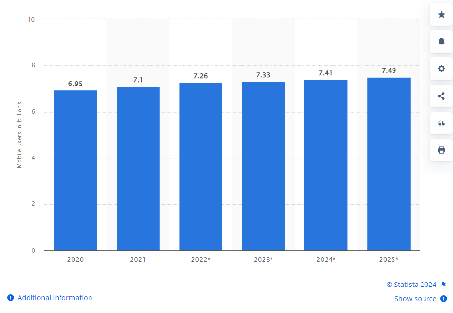
Source: Number of mobile users worldwide from 2020 to 2025, Statista
Statista notes that the number of mobile users worldwide stood at 7.1 billion in 2021. In 2025, the number is projected to reach 7.49 billion.
SEO mobile optimization is crucial for SEO success, and an experienced SEO agency can help you create a mobile-friendly experience.
The blog post will discover how to create a mobile-friendly experience that will skyrocket your SEO and keep your audience coming back for more.
Importance of Mobile Optimization in SEO
In today’s digital landscape, seo mobile optimization is not just a recommendation but a necessity.
Search engines’ shift towards mobile-first indexing underscores the critical role of SEO mobile optimization in enhancing visibility and user engagement.
Source: Backlinko
This approach ensures that websites are viewable and fully functional across various mobile devices, which is essential given that over half of global website traffic now comes from mobile.
Mobile search behaviors and SEO practices have evolved, making mobile search optimization SEO a focal point for businesses aiming to maintain competitive relevance in search engine rankings.
This detailed focus on mobile experiences directly impacts how sites are ranked and how effectively they reach their target audience.
Websites optimized for mobile benefit from increased organic search traffic, lower bounce rates, and improved user engagement metrics, all of which are crucial for SEO success.
Evolution of Mobile-Friendly Standards
The evolution of mobile-friendly standards has been rapid and transformative, driven by technological advancements and user behavior changes.
Initially, SEO mobile optimization was a mere adjustment to desktop-centric websites to make them somewhat usable on mobile devices.
Today, it incorporates sophisticated elements of advanced SEO, programmatic SEO, and AI in SEO to create seamless and intuitive user experiences.
Advanced SEO and Mobile Standards
Advanced SEO techniques have grown to emphasize mobile-specific strategies that account for the nuances of mobile browsing and interaction. This includes optimizing site architecture for mobile devices and ensuring the mobile user experience is as rich and engaging as the desktop experience.
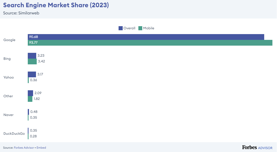
Source: Forbes
Advanced SEO practices also involve optimizing for voice search and local, predominantly mobile-driven SEO.
Programmatic SEO in Mobile Optimization
Programmatic SEO for mobile involves using software to generate pages automatically based on user demand and search trends. This approach helps handle vast arrays of keywords and landing pages more efficiently, making it a powerful tool for scaling mobile SEO efforts. It aligns well with mobile users’ needs for quick, relevant responses to their search queries.
AI in SEO for Mobile Optimization
AI technologies are increasingly integrated into SEO strategies, especially in analyzing mobile user behavior, customizing content delivery, and automating complex SEO tasks. AI can optimize mobile sites based on user interaction patterns and improve search rankings by tailoring content to mobile users’ specific preferences and search habits.
Leveraging Search Generative Engines (SGE) for Mobile SEO
Search Generative Engines (SGE) or represent a cutting-edge application of AI in SEO designed to generate content that is not only SEO-friendly but also tailored to mobile users’ preferences and behaviors.
These engines can dynamically adjust content and SEO strategies based on real-time analysis of mobile search trends, providing a significant edge in optimization.
Key Elements of Mobile-Friendly Websites
Implementing effective mobile search optimization SEO strategies is crucial for enhancing your website’s visibility on smartphones and tablets. Creating a mobile-friendly website is essential for businesses aiming to thrive in the digital age.
With most users accessing the internet via mobile devices, ensuring your site is optimized for these users is crucial.

This section explores the key components that make a website truly mobile-friendly.
Responsive Web Design
Responsive Web Design (RWD) is the backbone of a mobile-friendly website. It ensures your site’s layout and content look great and function well on all screen sizes, from mobile phones to desktops.
This approach is not only about aesthetic appeal but also about maintaining functionality and accessibility.
Flexible Layouts
Flexible layouts are fundamental to responsive web design. They use fluid grids that adapt and scale to any screen size.
Unlike fixed-width layouts that can create usability issues for mobile users, flexible layouts ensure that all elements of a website re-adjust based on the viewing environment. This adaptability is crucial for providing a consistent user experience across all devices, fulfilling the needs of mobile and desktop users.
Responsive Images and Media
Responsive images and media are critical in ensuring your website loads quickly and correctly on mobile devices.
Using CSS techniques or JavaScript, images and media files can be scaled appropriately, ensuring that they do not consume unnecessary data or slow down the page loading times on mobile networks. This improves user experience and supports SEO efforts as Google and other search engines prioritize page speed in their rankings.
Mobile Usability
With the rise in mobile internet usage, mobile search optimization SEO has become an essential aspect of digital marketing that can significantly influence your online presence. Mobile usability goes beyond making a site accessible. It’s about optimizing the site’s design and features for interaction on mobile devices.
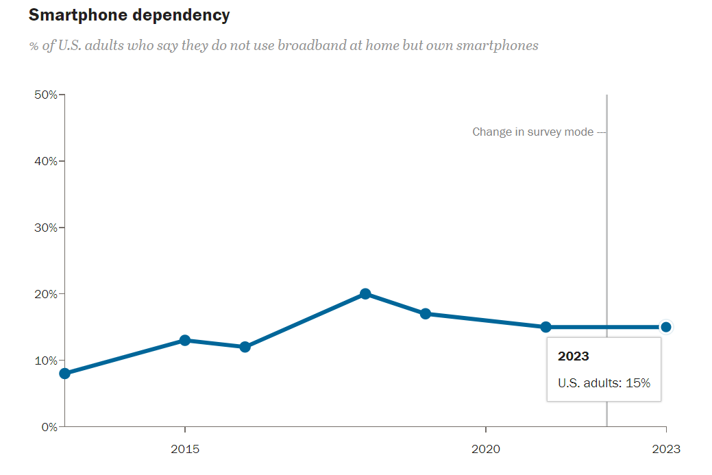
Source: Pew Research
This includes considering how users interact with your site using touch controls and navigating through content efficiently.
Touchscreen Readiness
To boost your rankings, consider adapting your content and design for mobile search optimization SEO, ensuring a seamless user experience across all devices. Touchscreen readiness is a crucial aspect of mobile usability. It involves designing elements such as buttons, links, and form controls with adequate size and space to accommodate finger taps.
This design consideration prevents user frustration and ensures smooth interaction, which is especially important in a mobile-first world where most mobile searches are performed on touch devices.
Mobile Navigation
Mobile navigation should be simple and intuitive. Menus should be easily accessible and navigable with a thumb, and the most important information should be readily available.
Simplifying the navigation menu and including a search function can greatly enhance the usability of the mobile version of a site, making it truly mobile-friendly.
Incorporating Advanced SEO and Google’s Tools
The importance of aligning with EEAT Google guidelines—expertise, experience, authoritativeness, and trustworthiness—can not be overstated when creating a mobile-friendly site. These factors improve user experience and enhance your site’s visibility in mobile search results.
Source: Forbes
International SEO plays a significant role in optimizing your mobile site for global audiences. Tailoring content to different regions and languages ensures that users receive a localized experience worldwide, improving engagement and conversions.
SEO automation tools are invaluable in managing these aspects efficiently. They can automate tasks such as tracking mobile usability issues, testing different mobile layouts, and deploying structured data across site versions.
Future SEO trends will likely emphasize more deeply integrated SEO mobile optimization as mobile devices become the primary internet access point for most users. Keeping an eye on these trends and preparing your site in advance can give you a competitive edge.
Using Google Search Console, you can monitor how well your mobile site is performing, understand how Google views your mobile pages, and make adjustments based on real-time data. This tool is essential for anyone serious about mobile SEO, as it provides specific insights into issues like mobile usability errors and confirms whether your pages are recognized as mobile-friendly.
Improving Site Performance on Mobile Devices
Optimizing your website’s performance on mobile devices is critical to enhancing user experience, increasing retention, and boosting conversions.
With the rise of mobile traffic, ensuring your site is mobile-friendly is more crucial than ever.
Speed Optimization
One of the best practices in mobile search optimization SEO is to ensure that your website loads quickly and navigates easily on mobile platforms. Speed is a pivotal factor in mobile usability.
Mobile users often access the internet on the go, and a slow-loading page can lead to increased bounce rates and lost opportunities.
Website speed optimization is, therefore, essential to keeping your mobile visitors engaged and satisfied.

Optimizing Images for Faster Loading
Images often account for most of the downloaded bytes on a web page. Optimizing them can have a profound impact on loading times:
- Compress Images: Tools like Adobe Photoshop, TinyPNG, or ImageOptim can reduce file size without losing quality.
- Use Appropriate Formats: JPEG for photographs, PNG for graphics with fewer than 16 colors, and SVG for web graphics and icons.
- Implement Responsive Images: Use HTML’s srcset attribute to serve different sized images based on the device screen size.
Leveraging Browser Caching
Browser caching is a powerful tool for improving site performance for repeat visitors. It involves storing parts of your site on the user’s browser so that they do not have to be reloaded with each visit. Here’s how to leverage browser caching effectively:
- Set Expiry Dates: Use the Expires header to set an expiry date for static resources. A longer expiry period is generally better for resources that don’t change often.
- Configure ETags: ETags (Entity Tags) are validators that help browsers determine if the content has changed since the last download.
- Leverage Cache Control: Use the Cache Control header to define the maximum age in the browser cache before a server re-fetch is required.
Integrating Advanced SEO Techniques
Implementing SEO mobile optimization and mobile search optimization SEO requires more than just structural and performance adjustments; it also means applying advanced strategies like natural language processing SEO and schema markup SEO to enhance understanding and indexing by search engines:
- Natural Language Processing (NLP) SEO: Utilize NLP to optimize your content for mobile SEO importance, tailoring your content to the informal, conversational queries common among mobile users.
- Schema Markup SEO: Implement structured data to help search engines better understand and display your content in mobile search results. This is especially useful for local SEO, where mobile users frequently look for business hours, locations, and reviews.
Regular Technical SEO Audits
Regular technical SEO audits are essential to maintaining and improving the performance of your mobile site. These audits help identify areas that need improvement, from slow-loading resources to poorly implemented meta tags that can impact your site’s mobile-friendly status.
- Audit Tools: Utilize tools like Google’s PageSpeed Insights, which specifically examines your site’s speed and performance on mobile devices, or Google Search Console, which helps monitor and maintain your site’s presence in Google Search results.
SEO Techniques Specific to Mobile
Mobile SEO optimization has emerged as a crucial strategy in the ever-evolving digital marketing landscape.
With more users accessing the internet via mobile devices than ever, optimizing your web presence for mobile is beneficial and essential. This section explores key techniques specific to mobile SEO that can enhance your site’s visibility and user engagement.
Mobile-First Indexing and SEO
Mobile-first indexing is a fundamental shift in how Google crawls and indexes websites.
Since most users now access Google via mobile devices, the search giant has started primarily using the mobile version of a webpage for indexing and ranking. This shift makes mobile SEO important and necessitates that your site is mobile-friendly for usability and better ranking in search results.
Implementing Mobile-First SEO
Ensure your mobile and desktop sites contain the same content to adapt to mobile-first indexing. Google must see your full site’s content on mobile versions to evaluate and rank it properly.
- Ensure Parity Between Mobile and Desktop: Your mobile site should include the same content on your desktop site. This includes text, images (with alt-attributes), and videos – ensuring that all formats are crawlable and indexable.
- Structured Data: Include the same structured data markup on both site versions. This helps Google’s algorithms understand the context of your content, improving how they index and display your site in search results.
- Metadata: Ensure that titles and meta descriptions are equivalent on both site versions. These elements are critical in conveying the relevance of your content to the user queries.
Local SEO for Mobile
Local SEO for mobile is increasingly important as more consumers use mobile devices to search for local information. Optimizing your local SEO strategy for mobile can drive more foot traffic to your store, enhance engagement, and increase conversions.
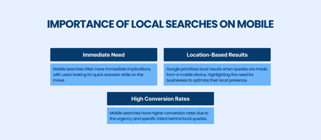
Importance of Local Searches on Mobile
Mobile devices are often used on the go, making local searches incredibly common for mobile users.
Optimizing for Local SEO
Optimizing for local SEO involves several strategic steps that ensure your business is visible to mobile users searching for services or products in your area:
- Google My Business: Set up and regularly update your Google My Business profile. This is crucial as it feeds information to a variety of places, including local pack listings and Google Maps.
- Mobile-Friendly Website: As mobile users are likely to access your site on their devices, having a mobile-friendly web page is essential. This means fast load times, easy navigation, and clickable elements that are optimized for touch.
- Local Keywords: Use local keywords in your content, meta titles, and descriptions. Tools like Google Analytics can provide insights into local search trends and help you fine-tune your keyword strategy.
- NAP Consistency: Maintain name, address, and phone number (NAP) consistency across all listings and on your website to improve your site’s credibility and ranking in local search results.
Partner with [A] Growth Agency for the Mobile Optimization for SEO
Mobile-friendly website is no longer a luxury. It’s necessary for online success, for which [A] Growth Agency will help you.
By prioritizing SEO mobile optimization, we will not just cater to a growing audience but also position your business for long-term growth and visibility.
Our experienced team specializes in turning entrepreneurial dreams into reality with effective, tailored growth strategies.
Moreover, we provide comprehensive support throughout the entire business lifecycle, from initial concept to market expansion.
Utilizing the latest tools and analytics, we help identify unique opportunities and overcome challenges, ensuring that every venture survives and thrives in competitive environments.
If this is for you, then go ahead!