
Every mid-market CEO eventually wants the same thing: a single dashboard where they can see the health of the business in one view. Real-time job profitability. Pipeline by stage. Cash conversion cycle. Anomaly alerts on expenses. CAC by channel.
Revenue retention. The pitch from every BI vendor sounds the same. Connect your systems. Build the dashboard. See everything in one place. Make better decisions, faster.
The failure pattern is remarkably consistent across all of those studies, and across the dozens of mid-market companies I have personally watched try this. Companies start with the visualization layer before fixing the data underneath it. The dashboard is not the problem. The data feeding the dashboard is the problem.
A dashboard is only as good as the integrations feeding it. If your underlying systems are not synced cleanly, the dashboard does not fix that. It just displays the inconsistency in a nicer format.
The Pattern That Repeats Across Mid-Market Companies
If you have spent any time in operations at a $20 million to $200 million company, you have seen this version of the story play out. Marketing pulls leads from a CRM like HubSpot or Salesforce. Operations runs a separate ERP, or in many service businesses, a vertical-specific platform like Service Fusion, Builder Trend, or Procore.
Finance uses QuickBooks or NetSuite. Field teams enter time and expenses through a fourth system. Each tool reports its own numbers honestly within its own boundaries. The problem is that none of them agree on what a customer is, when revenue is recognized, or which leads converted to which projects.
Then someone, usually a CEO or COO, who is tired of getting different numbers from different departments, decides the company needs a dashboard. The pitch sounds reasonable. We have all this data. Power BI can pull from anywhere. Tableau is enterprise-grade.
Let us build a unified view of the business. The CFO approves a budget. The IT team gets engaged, or an outside consultancy is hired. Six to twelve months and several hundred thousand dollars later, the dashboard is technically live. But nobody trusts it.
Marketing’s number is different from finance’s number. The expense anomalies it flags are not anomalies; they are routine. The pipeline view is missing 30 percent of the deals because they came in through a separate channel that was never integrated. The CAC calculation looks impossibly low because it does not include the offshore team’s labor. The CFO’s monthly close still relies on Excel exports. The CEO opened it twice, did not understand what he was looking at, and went back to asking the COO for verbal updates.
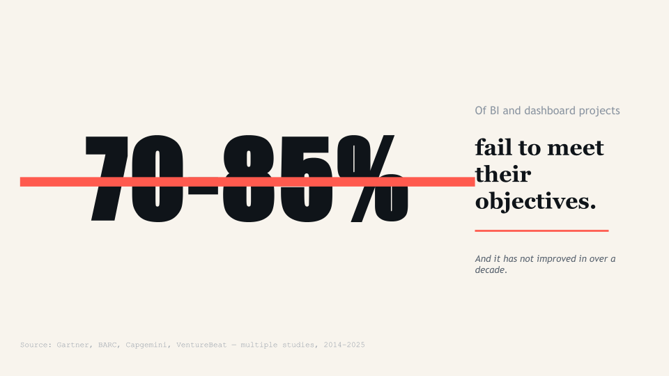
Research from BARC consistently shows that adoption rates for BI and analytics tools remain stuck around 25 percent on average, a figure that has not improved substantially in years. According to a 2025 study, only 16 percent of organizations achieve 100 percent Power BI dashboard adoption, while 58 percent languish under 25 percent adoption rates. The dashboards exist. People stop using them within weeks. They go back to spreadsheets, verbal updates, and gut feel. The company spent $300,000 to confirm that they prefer their old way of doing things.
The pattern is not a tooling failure. Power BI works. Tableau works. Looker, Sigma, Domo, Qlik, Cognos, all work fine. The pattern is that companies skip the foundational work and try to visualize their way out of a data problem. The visualization layer is the most visible part of a BI project, which is why it gets all the attention, the budget approval, and the demo time. The data layer underneath is where the actual work happens, and where most of the failures originate.
Why the Data Layer Breaks Before the Visualization Even Loads
There are five specific failures that show up almost every time, regardless of industry or company size. Each one happens upstream of the dashboard, which is why no amount of visualization tuning fixes them. If you have read this far and recognized any of these in your own company, you already know more than 80 percent of the executives who approve dashboard projects every year.
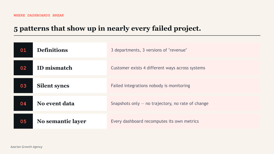
1. Data definitions that nobody actually agrees on
Revenue. Active customer. Qualified lead. Job profitability. These sound obvious until three departments define them differently. Finance counts revenue when it is invoiced. Operations counts it when the work is delivered. Marketing counts a qualified lead based on form submission scoring.
Sales counts it based on call disposition and CRM stage. Each is right within its own context. The dashboard inherits whichever definition the data engineer happened to encode, usually the one that was easiest to query. Other departments look at the result and say their numbers are wrong, because by their definition, they are.
This is not a technology problem. It is an alignment problem. And no amount of dashboard polish fixes it. The fix is a written, signed-off list of metric definitions, agreed by every department head before a single visualization is built. Most companies do not do this because the conversation is uncomfortable. The conversation is uncomfortable because the disagreements are real.
2. Inconsistent IDs across systems
In most mid-market stacks, the customer record in the CRM has a different identifier than the customer record in the ERP, the accounting system, and the project management tool. A customer named ABC Corp might be “ABC Corp.” in HubSpot, “ABC Corporation” in QuickBooks, customer ID 4471 in Builder Trend, and “ABC Corp Holdings LLC” in DocuSign. Without a master data layer that reconciles those identifiers, the dashboard cannot aggregate accurately.
A customer with three open jobs across three systems shows up as three different customers, or worse, gets joined incorrectly to a different ABC company entirely and inflates the wrong segment. The dashboard then shows that ABC Corp has $4 million in lifetime value when it actually has $1.2 million, or splits a single $1.2M customer into three different rows that look like new logos.
This kind of problem is invisible to the dashboard. It is invisible to most spot checks. It only becomes visible when someone tries to use the data for an actual decision and notices that the numbers do not match anyone’s intuition.
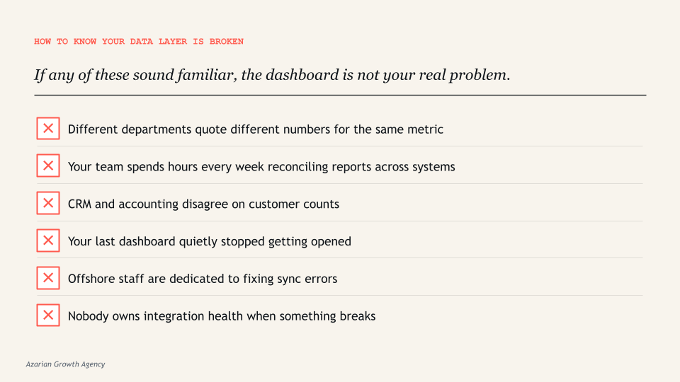
3. Sync errors that nobody is monitoring
If your team is spending hours every week reconciling differences between platforms, the dashboard inherits those errors silently. Stale data sources, broken refresh schedules, and version control failures are consistently cited as primary causes of dashboard projects falling out of executive use. The dashboard does not warn you that it is showing data from yesterday’s failed sync. It just shows what it has.
Most mid-market companies discover this the hard way. The CFO presents a dashboard to the board. Someone asks why the customer count dropped by 15 percent month over month. Nobody knows. Three days later, after the IT team had investigated, the answer turned out to be that the nightly sync between the ERP and the data warehouse failed for two days, and nobody had set up an alert. The board meeting was based on bad data. The damage to executive trust in the dashboard is permanent. From that point on, every number gets manually verified before any decision.
4. Missing infrastructure for cross-system events
Most operational decisions depend on events, not just states. When did this customer sign? How long did the deal sit in stage 3? What was the time between estimate and approval? What was the time between job completion and invoice? How many days did it take for a marketing-qualified lead to become a customer, and which channel did they enter through?
These questions require event tracking that most companies have never set up. The dashboard ends up showing snapshots of the current state instead of trajectories over time. Which is why so many “real-time” dashboards feel like last week’s news. They show what the data is right now, but not what it was an hour ago, a day ago, or a week ago, and certainly not the rate of change between those moments. For an operator trying to spot a problem before it becomes a crisis, snapshots are not enough.
5. No semantic layer to define metrics once
Without a centralized semantic layer, every dashboard recomputes its own version of every metric. The CFO’s dashboard calculates margin one way. The CEO’s dashboard calculates it differently. The board deck calculates a third. The investor update calculates a fourth. This is how you end up in meetings where executives argue about whose number is right. The dashboard surfaces the disagreement, but the disagreement was already there in the data layer, hidden inside the calculation logic of each report.
The semantic layer is the technical solution to this problem. It is a centralized location where every metric is defined exactly once, in plain language and in code, and every dashboard pulls from that single definition. Tools like dbt, LookML, and Power BI’s semantic models exist specifically for this. Without one, drift is inevitable. With one, every chart agrees by default because every chart is calculating from the same source of truth.
What Has to Happen Before You Build the Dashboard
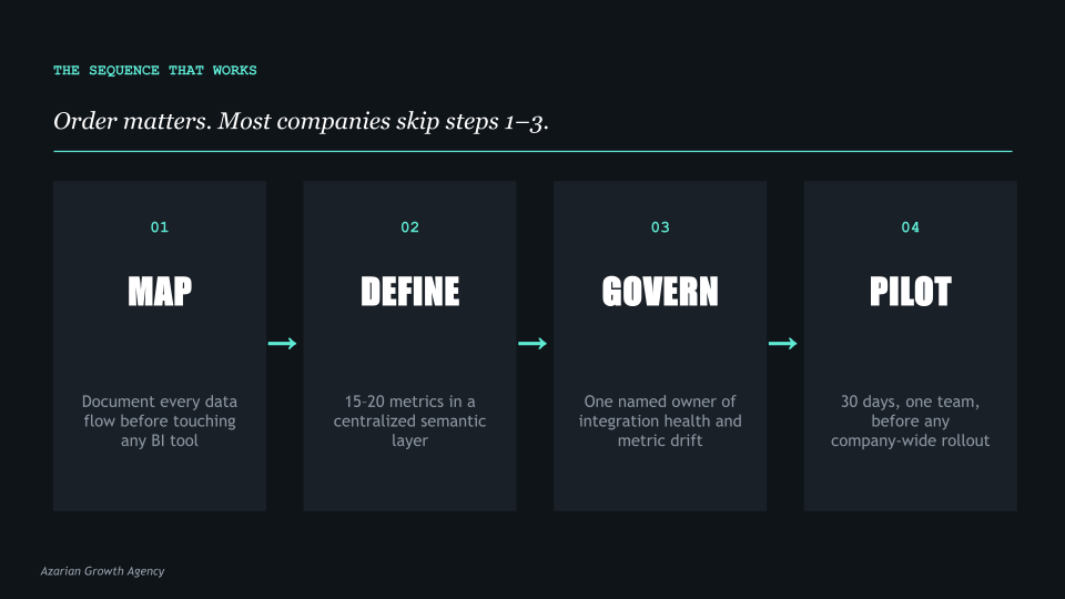
The companies that get this right do four things in order, and they do not skip steps. The order matters. I have watched companies try to do steps 1 and 4 simultaneously, which usually produces a beautiful dashboard built on quicksand.
I have watched others try to do step 3 in isolation, which produces clean integrations that nobody is using because no metrics were ever defined. The sequence below is what works.
Step 1. Map every data flow before touching the visualization tool
Before any vendor opens Power BI or Tableau, sit down with your operations team and document where data originates, where it moves, what transformations happen along the way, and where it lands.
This is not a one-hour exercise. For a $50 million company with five core systems, expect this to take two to three weeks of dedicated work. You are looking for every export, every API connection, every manual reconciliation, every CSV that someone uploads weekly because the integration broke six months ago and nobody fixed it.
This usually reveals two or three integration points that nobody owns and several that are running on manual exports. It often reveals that the company has been operating on bad data for longer than anyone realized, because the last person who understood the integration left two years ago.
Most companies skip this step because it is unglamorous. It is also the step that determines whether the dashboard works.
Step 2. Define metrics in a semantic layer, not in the dashboard
Pick the 15 to 20 metrics that actually drive decisions. Not the 200 metrics that could theoretically matter, but the 15 to 20 that the leadership team would actually use to run the business. Write them down.
Define each one in plain language so a non-technical executive can read the definition and understand exactly what is being measured. Then encode each definition in a centralized semantic layer that every dashboard, every report, and every export pulls from.
This is what tools like dbt, LookML, and Power BI semantic models exist for. When metric definitions live in one place, every chart agrees by default. When they live inside individual dashboards, they drift within weeks because someone tweaks a calculation for a specific report and forgets to update the others.
The discipline of defining metrics once and reusing them everywhere is the single biggest predictor of whether a dashboard project is still being used 12 months after launch.
Step 3. Fix the integration layer with proper governance
Companies with weak governance strategies are 60 percent more likely to experience poor decision-making. Governance does not mean bureaucracy. It does not mean a 50-page data policy document that nobody reads. It means somebody owns the integration health, somebody monitors sync errors, and somebody has the authority to fix breaks when they happen. This is operational, not strategic. It is the part most consulting firms do not talk about because it is not the fun work.
In practical terms, governance for a mid-market company looks like a single named owner of the data layer, automated alerts for sync failures, a documented process for adding new data sources, and a quarterly review of metric definitions to catch drift. None of this is glamorous. All of it is what separates a dashboard that drives decisions from a dashboard that becomes a vanity project.
Step 4. Pilot with one team before scaling
Build the first version of the dashboard for one department, with one clear use case, and run it for 30 days. See what they actually look at. See what they ignore. See what they ask for that is not there. Then iterate. The companies that go straight to a company-wide rollout almost universally end up with a dashboard nobody uses, because the design assumptions were wrong and there was no feedback loop to correct them.
Pilot scope matters. The right pilot is one department, three to five core metrics, and a 30-day commitment from the team to use the dashboard for daily decisions. At the end of 30 days, you will know what works, what does not, and what is missing. That information is worth more than three months of upfront design discussions, because it is grounded in actual usage instead of stated preferences.
What This Looks Like in Practice
To make the data layer problem concrete, here are three patterns I have seen repeatedly across companies in the $20 million to $200 million range. The names are anonymized, but the situations are real.
The construction company with the unified dashboard that had three definitions of revenue
A specialty contractor doing about $80 million in annual revenue commissioned a Power BI dashboard to give the CEO a single view of the business. The vendor delivered on time. The dashboard pulled from Builder Trend, QuickBooks, and Service Fusion. Within two weeks, the CFO and the COO were having a recurring argument about why the revenue number on the CEO’s dashboard did not match the revenue number in the monthly close.
The answer turned out to be that finance recognized revenue at invoice, operations recognized it at job completion, and the data engineer who built the dashboard had picked the operations definition because it was the easiest to query. Three months and $40,000 in additional consulting fees later, the dashboard was rebuilt around the finance definition. Then the COO started disagreeing with the operational metrics. The dashboard was never trusted again.
The SaaS company that built six dashboards before defining the customer
A B2B software company with 1,200 customers built six different dashboards across marketing, sales, customer success, finance, product, and the executive team. Each dashboard had its own definition of an active customer. Marketing counted any account with a logged-in user in the last 90 days. Sales counted any acco
unt with a paid contract regardless of usage. Customer success counted any account that had attended at least one onboarding session. Finance counted any account that had paid an invoice in the current quarter. Product counted any account with at least one weekly active user.
When the executive team tried to agree on the company’s customer count for an investor update, they found six different numbers ranging from 847 to 1,184. The investor update was delayed three weeks while the team built a master customer definition and rebuilt the dashboards around it.
The professional services firm that bought a BI tool before mapping its data
A consulting firm with about $35 million in revenue bought Tableau before doing any data flow mapping. The IT team spent four months building integrations and dashboards. When the dashboards launched, executives quickly noticed that the utilization numbers did not match anyone’s intuition.
After a month of investigation, the team discovered that the time tracking system was producing duplicate entries when consultants logged time across multiple projects, the project management system had four different statuses for “complete” that meant different things in different practices, and the CRM had not been synced to the financial system in 18 months. The dashboard was correct given the data it had. The data was wrong. The fix took six months and required pausing the dashboard work entirely.
The pattern in all three cases is the same. The visualization tool was not at fault. The integration vendor was not at fault. The data engineers were not at fault. The fault was in the sequencing. Everyone tried to build the dashboard before the data layer was ready to support one.
The Operator’s Question Every CEO Should Ask
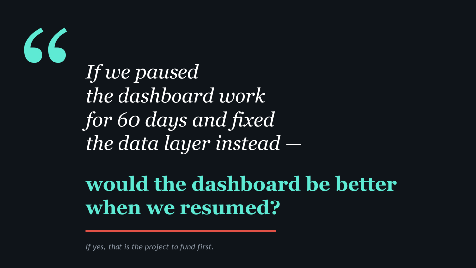
Before approving a dashboard project, ask the team building it one question: if we paused the visualization work for 60 days and spent that time fixing the data layer instead, would the dashboard be better when we resumed?
If the answer is yes, that is the project you should fund first. The visualization work can wait. The data layer cannot, because every day it stays broken, more people in the company make decisions on bad numbers and lose more trust in the data. If the answer is no, ask harder questions.
Why is the data layer fine? What integrations are running? Who owns them? What happens when one breaks? Most teams that say the data layer is fine have not actually checked. They have just not had a recent incident.
The data layer is almost always the bottleneck. Vendors do not lead with this because it is harder to scope, harder to price, and less satisfying to demo. A dashboard project has a clear deliverable: the dashboard.
A data layer project has a less satisfying deliverable: the dashboard you eventually build will work better. Most BI consultancies are structured around the visible work, not the foundational work. Which is why most BI consultancies oversell dashboards and undersell the foundation those dashboards have to sit on.
If three of your offshore staff are currently fixing sync errors between your systems, the dashboard you build on top of that will display those errors faster. The fix is not a better dashboard. The fix is upstream.
What a Dashboard Project Looks Like When It Works
To balance this picture, here is what the same company looks like when the sequence is run correctly. A $60 million distribution company with five core systems decided in early 2024 that they wanted a unified executive dashboard. Their CEO had read enough about failed BI projects to be skeptical. Instead of starting with a vendor demo, he started with a six-week data audit.
In weeks one through three, the operations team mapped every data flow across HubSpot, NetSuite, ShipStation, a custom inventory system, and a Snowflake warehouse that had been set up two years earlier and was now partially abandoned. They found 14 active integrations, 6 of which had no documentation, 3 of which were producing silent errors, and 2 of which were running on manual CSV uploads from a single employee who was about to retire.
In weeks four and five, the leadership team agreed on 18 core metrics. Each was defined in plain language by the relevant department head and reviewed across departments. Three of the 18 metrics produced disagreements that took a full leadership meeting to resolve. The disagreements were about real things. Resolving them in a meeting was less expensive than resolving them in a dashboard six months later.
In week six, the team picked one department, customer success, and built a single-purpose dashboard for them. It tracked five metrics and was used daily. After 30 days, the team made specific changes based on actual usage. After 60 days, the same team was using the dashboard to drive their weekly meeting, and three other departments had asked when their version would be ready.
By the end of month four, the company had a working executive dashboard built on a clean data layer with documented definitions and an owner who monitored integration health. The total cost was about $180,000 across consulting and internal time. The previous dashboard project, which the company had abandoned a year earlier, had cost $260,000 and produced nothing usable.
The difference was in the sequence. Same company, same systems, same vendors available. The second attempt worked because the data layer was fixed first.
The Bottom Line
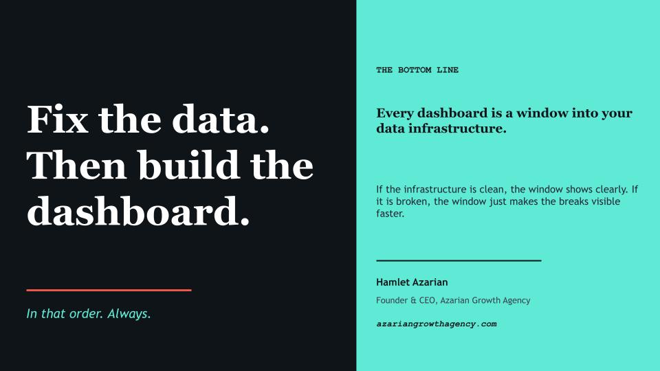
Every dashboard is a window into a company’s data infrastructure. If the infrastructure is clean, the window shows clearly. If the infrastructure is broken, the window just makes the breaks visible faster. The dashboard is downstream of everything that matters.
The companies that build dashboards that actually drive decisions do not start with the dashboard. They start with the data layer. They map flows, define metrics in one place, fix the integration layer, and pilot with one team before scaling. It takes longer at the start. It is also the only sequence that works in the medium term, and the only sequence that produces dashboards executives actually trust enough to use for real decisions.
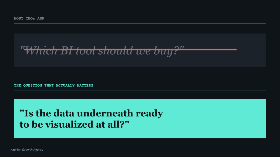
The question is not which BI tool to buy. The question is whether the data underneath is ready to be visualized in the first place. Most companies that approve dashboard projects have never seriously asked that question. The ones that do are the ones whose dashboards are still being used a year later.
The right time to build a dashboard is after the data layer is ready. The wrong time is the day someone gets frustrated with the current reporting and approves a budget.