BREAKING NEWS: Half of your potential customers are walking away before your landing page even loads.
Shocked you, right?
But here’s the reality check—if your landing page isn’t mobile-friendly, it’s not just an inconvenience; it’s a silent business killer.
Did you know that 71% of mobile users will bounce off a page that doesn’t perform well on their device? Let that sink in as well.
Every bounce isn’t just a number—it’s a customer who might have clicked “Buy Now,” signed up, or reached out, but instead, they vanished into the digital ether.
In this age of endless scrolling and instant gratification, your landing page needs to be more than just “functional.”
It has to be a magnet for attention, a conversion machine, and a seamless experience all at once.
And here’s where a smart Landing Page Agency can be your secret weapon, helping you transform a clunky mobile page into a conversion powerhouse.
So, buckle up because this guide is your crash course in building mobile-friendly landing pages that don’t just work—they wow.
Let’s make sure your landing page gets swipes, not sighs, and turns visitors into your next success story.
Ready to dive in?
Think Small, Win Big: Why Simplicity Reigns Supreme
In the world of mobile friendly landing pages, simplicity isn’t just a design choice—it’s a survival tactic.
Picture your users: scrolling on the go, balancing coffee in one hand and a phone in the other.
They’re not here for a novel; they’re here for answers.
A minimalist design ensures that your landing page elements don’t just attract attention—they hold it.
And in today’s fast-paced digital world, holding attention is half the battle.
Why Simplicity Matters
Let’s get into the psychology of your mobile audience.
They’re goal-oriented, time-sensitive, and easily distracted.
Studies show that if your page doesn’t load or provide clarity within three seconds, they’re gone—off to a competitor whose product landing page respects their time.
Worse yet, a cluttered landing page design can leave them confused, costing you conversions.
Simplicity is the bridge between your audience’s intent and your desired action.
By focusing on what truly matters, you’re not only improving landing page performance but also answering a critical question: Which attributes describe a good landing page experience?
Best Practices for Mobile Simplicity
- Streamline Your Layout A mobile friendly landing page thrives on single-column layouts. Why? Because scrolling feels natural on mobile. By placing vital content—your headline, benefits, and CTA—at the top, you guide users seamlessly to action. Think of it as designing a staircase: each step brings them closer to your conversion goal.
- Trim the Fat Imagine landing on a page crammed with text. Overwhelming, right? Mobile users don’t read; they scan. Focus your landing page marketing efforts on concise, punchy messaging. For example, instead of “Our innovative software simplifies project management for businesses worldwide,” say, “Simplify your workflow—start now.”
- Cut Distractions Every unnecessary button, pop-up, or flashy banner is a roadblock. What is the golden rule of landing page optimization? Keep it focused. One goal, one CTA, one smooth path to conversion.
Real-Life Inspiration: The Squarespace Effect
Squarespace nails the minimalist mantra.
Their mobile friendly landing page isn’t just a stripped-down version of their desktop site; it’s a masterclass in clarity.
No overwhelming menus. No competing CTAs.
Just a singular focus on what they want users to do—“Start Your Free Trial.”
Source: Squarespace
It’s proof that less truly is more, especially for b2b landing pages or saas landing pages.
The Secret Sauce: Which Attributes Describe a Good Landing Page Experience?
Here’s a quick breakdown of what makes a landing page design truly exceptional for mobile:
- Clarity: Can users understand your offer in seconds?
- Focus: Is there a single, unmistakable CTA guiding them?
- Speed: Does the page load in less than three seconds?
- Engagement: Are the visuals sharp, relevant, and quick to load?
- Responsiveness: Does your design adapt perfectly to any screen?
When these elements work together, your landing page SEO improves naturally, and your users?
They stick around.
Speed is the Real MVP: Load Times that Convert
Imagine this: your mobile friendly landing page finally attracts the perfect visitor.
They’re curious, interested, and just seconds away from taking action. But then—your page stalls.
They wait. And wait. And then they’re gone.
Just like that, you’ve lost a potential customer.
Speed isn’t just a technical metric—it’s the heartbeat of your landing page design.
In the race to win conversions, the slowest player always loses.
Now, let’s think about this: every second longer, your page loads, your bounce rate skyrockets, and your chances of improving landing page performance plummet.
Why It’s Crucial: The Science of Speed
Mobile users are impatient, and rightly so.
They’re juggling a million things—scrolling during commutes, waiting for coffee, or sneaking a peek between meetings.
They don’t have time to wait for a SaaS landing page or product launch landing page to load at a snail’s pace.
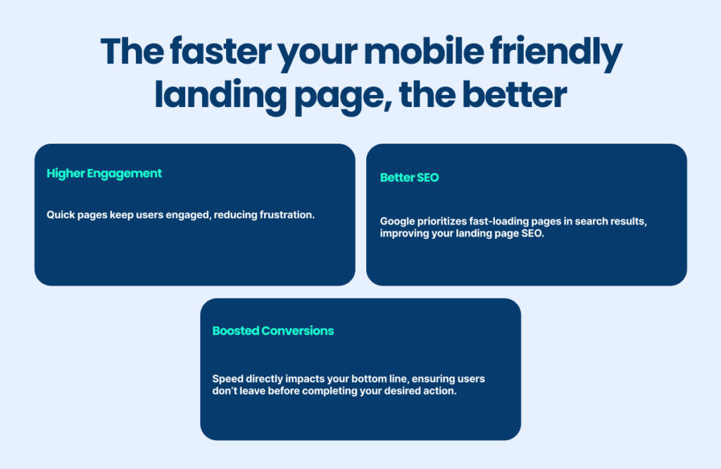
A fast-loading page isn’t just nice to have—it’s essential for creating a seamless experience and ensuring high retention rates.

Best Practices for Lightning-Fast Load Times
1. Test, Analyze, Fix
To fix speed issues, you need to know where the problem lies.
Use tools like Google PageSpeed Insights to analyze your page’s load times and get actionable recommendations.
Tools like GTmetrix and Pingdom are also great for identifying bottlenecks in your landing page elements.
2. Compress, Don’t Compromise
Large files are the silent killers of mobile friendly landing pages. Optimize every image on your site:
- Use formats like WebP for smaller file sizes without losing quality.
- Compress files using tools like TinyPNG or ImageOptim.
- Limit auto-playing videos or animations—they’re engaging but can significantly slow things down.
And don’t forget about your code. Minify HTML, CSS, and JavaScript files to decrease load times.
A clean, lean codebase makes for faster and smoother landing page optimization.
3. Prioritize Above-the-Fold Content
Load your critical landing page elements—headline, CTA, and visuals—first.
This gives the user something to interact with while the other elements of the page load in the background.
It’s a clever way to keep them engaged and reduce bounce rates.
Unique Hack: The 2-Second Rule
Google’s research shows that every additional second a page takes to load reduces conversions by up to 20%.
The sweet spot? Aim for a sub-2-second load time.
For b2b landing pages targeting decision-makers or product landing pages meant for impulse buyers, this can be a game-changer.
Want to take it even further? Shoot for under 1 second.
Achieving this requires advanced techniques like lazy loading, leveraging browser caching, and hosting assets on a content delivery network (CDN).
These tweaks can make your page lightning-fast and boost your landing page marketing efforts significantly.
Copy that Hooks: Short, Pithy, and Impactful
If your mobile friendly landing page doesn’t grab their attention with snappy, clear copy, they’re gone faster than you can say, “conversion rate.”
Your words are precious real estate, and on mobile, the space is even tighter.
Every headline, subhead, and snippet must work overtime to pull users in and guide them toward action.
The key? Simplicity, clarity, and impact.
Why It’s Necessary
Mobile users aren’t here to linger; they’re here to solve a problem, find an answer, or snag a deal.
That means your landing page elements need to shout value fast.
The reality is simple:
- Overloaded copy? Swipe left.
- Clear, actionable headlines? Swipe right—and convert.
Effective copy doesn’t just improve landing page performance—it builds trust, communicates your value, and leads users to your call-to-action.
Best Practices for Impactful Mobile Copy
1. Keep Headlines Punchy and Purposeful
Your headline is the billboard for your mobile friendly landing page. It should:
- Be short: Aim for no more than 5-8 words.
- Be clear: State exactly what you’re offering or solving.
- Include action words: Inspire users to take the next step.
Examples:
- “Save Time. Boost Sales.”
- “Try Now, Pay Later.”
- “Smarter Software for Busy Teams.”
2. Trim the Fat
Gone are the days of long-winded explanations. Break down your content into digestible chunks:
- Use bullet points sparingly for clarity.
- Incorporate whitespace to let your words breathe.
- Cut the jargon and get straight to the point.
For instance, a product landing page for a task management app could swap:
“Experience unparalleled organizational efficiency through our robust suite of tools designed to simplify your workflow”
for:
“Stay organized. Simplify your day with our task tools.”
3. Highlight Benefits, Not Features
Users care about what’s in it for them. Focus your copy on the outcome they’ll get, not the process.
- Feature: “Our app uses advanced AI for scheduling.”
- Benefit: “Never miss a deadline again.”
Apply this principle across your landing page marketing efforts to ensure users see immediate value.
The CTA Glow-Up: Big Buttons, Big Results
On a mobile friendly landing page, the Call-to-Action (CTA) is the star of the show.
It’s not just a button; it’s the bridge between curiosity and conversion.
But here’s the catch: if your CTA doesn’t stand out, your users won’t take action.
And in the world of mobile, action is everything.
A great CTA isn’t just about looking good—it’s about being unmissable, irresistible, and easy to interact with.
It’s the moment your landing page elements come together to seal the deal.
Why It’s Important
Think of your CTA as the GPS for your users.
Without it, they’re lost in the content maze, unsure of what to do next.
On mobile, where screen space is limited, and attention spans are even shorter, your CTA needs to shout, “Click me!”—without overwhelming the user.
CTAs drive conversions by:
- Offering a clear next step.
- Reducing decision fatigue.
- Streamlining the user journey.
But a weak, hidden, or confusing CTA? That’s a conversion killer.
Best Practices for CTA Success
1. Contrast is King
Your CTA button should pop like neon against a dark sky.
Use bold, contrasting colors that draw attention. If your page’s theme is soft blues, go for a bright orange or vibrant green button.
The goal? Make your CTA unmissable.
Example: A saas landing page could use a blue background with a standout yellow “Start Free Trial” button.
2. Keep it Singular
One page, one goal, one CTA. Multiple CTAs can confuse users and dilute your conversion potential.
Whether it’s “Buy Now” or “Learn More,” stick to a single, crystal-clear directive.
Pro Tip: Secondary CTAs (like “Learn More” or “See Pricing”) should be visually understated, ensuring the primary action remains the focal point.
This is especially important for b2b landing pages targeting decision-makers.
3. Go Sticky
Introducing the unsung hero of landing page best practices: the sticky CTA button.
As users scroll, this button stays within reach, gently nudging them toward action without being intrusive.
Source: Ruggable
Why It Works: Mobile users navigate quickly and often forget the action they intended to take. A sticky CTA ensures the option is always there, increasing your chances of conversion.
Navigation, Reinvented: Hamburger Menus and Sticky Bars
Navigation isn’t just about getting from point A to point B—it’s about creating a smooth user experience that keeps visitors engaged.
A cluttered navigation bar can feel overwhelming on a small screen, while a well-thought-out menu guides users effortlessly toward their goals.
In the world of mobile friendly landing pages, navigation isn’t just functional; it’s strategic.
Done right, it becomes a subtle yet powerful driver of conversions.
Why It Matters
Navigation is the backbone of usability.
On mobile, where screens are small, and attention spans are smaller, intuitive navigation can make or break your landing page design.
If users can’t find what they’re looking for—or worse, feel lost—they’re likely to bounce.
On the flip side, smooth navigation makes sure visitors stay engaged and take action.
Best Practices for Mobile Navigation
1. Hamburger Menus for Cleaner Layouts
The hamburger menu has become the gold standard for mobile navigation.
Why? It hides the clutter of a full navigation bar, leaving your landing page elements clean and visually focused.
Source: JustInMind
With a single tap, users can access options without distractions.
Pro Tip: Limit menu options to essential pages. For example, on a product landing page, include “Features,” “Pricing,” and “Contact”—no fluff.
2. Sticky Menus for Seamless Browsing
Sticky menus are a game-changer for mobile UX.
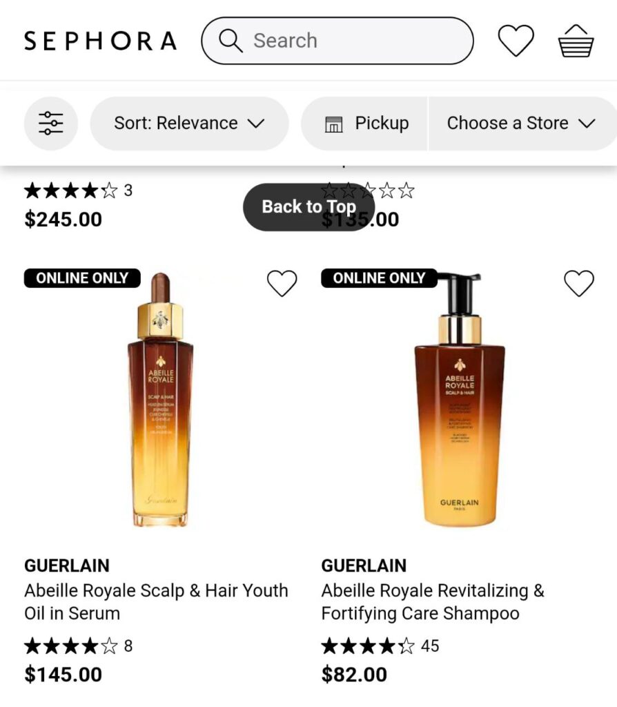
These floating elements remain visible as users scroll, offering instant access to key actions like “Buy Now” or “Contact Us.”
Think of them as your digital tour guide, always ready to assist.
Example: On a b2b landing page, a sticky “Request a Quote” button ensures decision-makers can act the moment they’re convinced.

Source: Sephora
3. “Back to Top” Buttons
Long-form pages—like detailed saas landing pages—can overwhelm users.
Source: Shopify
A simple “Back to Top” button eliminates endless scrolling and keeps users focused on their journey.
Cool Insight: Sticky Elements in Action
Take an eCommerce product launch landing page.
Without sticky navigation, users might scroll through multiple sections—details, reviews, FAQs—only to feel lost when ready to purchase.
Add a sticky “Add to Cart” button, and conversions soar. It’s a small tweak with a big impact on landing page performance.
Testing and Tweaking: The Secret Sauce to Perfection
Here’s a hard truth: even the most stunning mobile friendly landing page can fall flat if it doesn’t perform well across devices.
Your page might look flawless on an iPhone but break down on a Samsung Galaxy.
It’s a sobering reality but also an exciting opportunity—because, with testing and tweaking, perfection isn’t just a goal; it’s a strategy.
Testing is the bridge between good and great. It’s how you ensure your landing page design doesn’t just look good but works seamlessly, converts consistently, and keeps users coming back.
Why It’s Non-Negotiable
Think of testing as a safety net for your landing page elements.
Without it, you’re flying blind, assuming your page will work on every browser, screen size, and device.
The stakes are high:
- A poorly tested page can tank your conversions.
- Even small issues—like a misplaced button or a slow-loading image—can lead to massive user drop-offs.
The good news? Testing doesn’t just prevent mistakes—it uncovers opportunities.
Small tweaks, like changing a button color or tweaking a headline, can lead to significant gains in landing page performance.
Best Practices for Testing and Tweaking
1. A/B Testing: Experiment for Excellence
A/B testing is your secret weapon for fine-tuning landing page marketing.
By running two versions of a page—one with a red button, one with a green—you can see what resonates better with your audience.
What to Test:
- CTAs: Placement, color, and wording.
- Headlines: Do benefit-driven headlines outperform emotional ones?
- Layouts: Does a single-column layout drive more clicks than a two-column one?
Pro Tip: Always test one element at a time. If you test too many changes at once, you won’t know what’s making the difference.
2. Cross-Browser and Responsive Testing: Cover All Bases
Your mobile friendly landing page must perform flawlessly on every device and browser.
Tools like LambdaTest make this process seamless, allowing you to test your page across 3,000+ browser and device combinations.
Why It Matters:
- Ensures your page looks and functions well on different screen sizes.
- Identifies issues with older browsers, ensuring accessibility for all users.
Example: A saas landing page might look perfect on Chrome but display broken forms on Safari. Regular testing catches these issues before they impact your users.
3. Test the Small Things: Big Impact, Low Effort
Never underestimate the power of small changes.
Adjusting button color, headline size, or even spacing can significantly affect user behavior.
Small change, massive payoff.
Pro Insight: The Continuous Testing Mindset
Testing isn’t a one-time activity; it’s an ongoing process.
User behavior evolves, trends change, and new devices emerge.
Regular testing ensures your landing page ideas stay fresh and relevant.
Your Mobile Masterpiece Awaits
Your mobile friendly landing page is more than just a digital handshake—it’s the cornerstone of your success.
From streamlined navigation to lightning-fast load times, from punchy copy to unmissable CTAs, every detail matters.
Your audience is scrolling fast, and your landing page needs to keep up.
Here’s the bottom line: adapting to a mobile-first audience isn’t optional—it’s essential.
By embracing simplicity, testing relentlessly, and prioritizing user experience, you’re not just improving your landing page design; you’re building trust, engagement, and conversions.
At Azarian Growth Agency, we specialize in transforming businesses into mobile-first powerhouses.
Whether you’re designing a saas landing page, brainstorming product landing page ideas, or optimizing your landing page marketing strategy, our team is here to help.
As a leading landing page agency, we don’t just create pages—we craft experiences that convert.
Now it’s your turn. Use the insights and strategies from this guide to refine your approach, implement what works, and keep iterating.
In the ever-changing digital landscape, continuous improvement is your best competitive edge.
Your masterpiece isn’t just a landing page—it’s a gateway to growth. Let’s build it together.

