Have you ever wondered why some landing pages effortlessly capture leads while others fall flat?
The answer lies in the trends.
A well-crafted landing page is the difference between a casual visitor and a loyal customer.
By understanding and implementing the latest strategies, you can transform your landing pages into high-converting powerhouses.
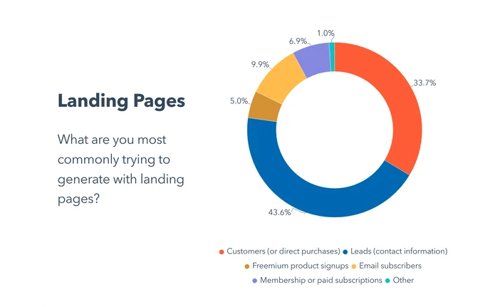
43.6% of marketers report generating leads as their goal.

Source: HubSpot
The source also highlights that the average landing page conversion rate across all industries is 5.89%.
Thus, 3 major goals for having optimized landing pages are:
- Increase Conversion Rates
- Improve Customer Acquisition Costs (CAC)
- Build Brand Credibility and Trust
The statistics and the above-mentioned goals indicate that to stay ahead of the curve, you need to know the latest landing page trends and approaches.
With the help of a Landing Page Optimization Agency, you can champion the competition.
What to do next? Join us as we explore 12 essential tips to boost your conversions.
1. What’s the Big Deal with Landing Page Optimization? (And Why You Should Care)
Landing page optimization isn’t just a passing trend. It’s a vital strategy for business growth.
Think of it as a digital first impression. Whether your goal is to attract more qualified leads, lower acquisition costs, or simply make the most of your marketing budget, optimized Landing Pages give your business a solid foundation to turn visitors into customers.
Why Landing Page Optimization is Crucial for Growth
1. Lower Customer Acquisition Costs by Focusing on Efficiency
Running ads isn’t cheap, and when visitors arrive at a poorly optimized landing page, they’re more likely to bounce than buy.
A well-optimized landing page reduces your cost per acquisition (CPA) by increasing the likelihood that each visitor will take action, whether that’s signing up, subscribing, or making a purchase.
By focusing on optimizing landing page trends—like simplifying layouts, improving load times, and using persuasive CTAs—you reduce ad spend waste and maximize every dollar.
- Efficiency is Profitable: Publications show that landing pages optimized for user experience can reduce bounce rates by up to 60%, allowing more of your ad spend to translate directly into conversions.
- Actionable Tip: Consider A/B testing different headlines or CTA button placements. A slight tweak can sometimes lead to big changes in your acquisition costs.
2. Boost Your Ad ROI with Higher Conversions
When your landing pages are designed with optimization in mind, visitors get a clear, immediate understanding of your offer and why it’s worth their time or money.
Source: HubSpot
Whether you’re targeting new or returning visitors, landing page optimization trends focus on reducing distractions, making essential information easily accessible, and enhancing the call-to-action elements. This doesn’t just help visitors decide; it compels them to take action.
- Examples of Conversion Boosting Elements: Concise, benefit-focused headlines, minimalistic layouts, and strategically placed CTAs are elements proven to increase conversion rates.
2. Less is More: Mastering Minimalist Design for Conversions
A minimalist design might seem overly simple at first, but it’s one of the most powerful landing page optimization trends when it comes to maximizing conversions.
For B2B landing pages especially, the “less is more” approach is essential in capturing attention without overwhelming visitors. This approach can make a big impact in guiding users toward your desired call-to-action (CTA) with no distractions in the way.
Why Simplicity Wins: Clean Design = More Conversions
Today’s visitors are busy and distracted, which is why a clean, simple design is more effective than a cluttered, complex one. When it comes to a B2B landing page, too much information can cause users to click away before they reach the CTA.
Source: Azaryan Growth Agency
The minimalist design removes visual clutter, making the page more intuitive and guiding visitors effortlessly to the core message.
- Focus on the Essentials: In minimalist design, every element on the page has a purpose, focusing the user’s attention where it matters most—your CTA. No extra graphics, pop-ups, or lengthy text blocks are competing for attention.
- Emotional Clarity: A clean design helps convey professionalism, trust, and transparency. Studies show that 76% of users say that ease of use is the most important factor in their website experience, and 94% say design quality affects their trust in a brand.
- Less Bounce, More Conversion: Research by HubSpot shows that minimalist, visually clean landing pages often have a bounce rate 20-30% lower than cluttered pages, as they create a more direct pathway to conversion.
So why does a simple design work so well? It’s human nature. When there’s less noise, our brains are able to focus on what’s in front of us.
For your landing page, this means that visitors see the message faster, understand the value more clearly, and are less likely to get sidetracked by unnecessary distractions.
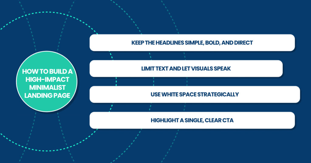
How to Build a High-Impact Minimalist Landing Page

Applying minimalist design on your landing page doesn’t mean sacrificing functionality or skimping on details—it’s about strategic focus.
3. Above-the-Fold Magic: Why First Impressions Still Matter
Creating a powerful first impression on a landing page can make the difference between a visitor exploring further or bouncing off immediately.
Above-the-fold design—the section of your landing page visible before users scroll—remains one of the most critical landing page best practices in grabbing attention and sparking engagement instantly.
Crafting Compelling Headlines That Grab Attention
A headline is often your first and best chance to connect with visitors, showing them exactly how your offer can solve their pain points or fulfill their needs.
Source: Azaryan Growth Agency
With an effective headline, you can establish rapport, spark curiosity, and prompt visitors to keep scrolling.
- Address Visitor Needs Directly: Get straight to the point by focusing on the visitor’s needs. Instead of generic language, use words that convey specific benefits. Think of it as saying, “Here’s exactly what we can do for you” right from the start. For example, if your product simplifies payroll for small businesses, try a headline like “Cut Payroll Processing Time by 50% in One Easy Step.”
- Use Action Words to Evoke Urgency: Phrases like “Boost Your Sales Today” or “Streamline Your Operations Instantly” tap into an immediate call to action. Using action-oriented language in your headline gives it a sense of urgency and prompts visitors to engage right away.
- Incorporate Emotional Appeal: Don’t hesitate to use phrases that speak to pain points. Phrases like “Tired of Slow Processes? Here’s a Faster Way…” resonate on an emotional level and can be very effective in capturing attention.
- Keep It Concise and Impactful: Visitors are scanning, not reading. The best headlines are usually no more than 10-12 words, making them short enough to digest instantly yet long enough to convey a powerful message. Use A/B testing to find the optimal length for your audience.
- Consider Data for Credibility: Numbers and statistics lend credibility and can make a headline feel more trustworthy. For instance, “Trusted by 10,000+ Business Owners Worldwide” or “Increase Conversions by 30% with Our Solution” adds a level of authority that appeals to B2B visitors.
By using these techniques, you’re creating a headline that doesn’t just sit there—it pulls visitors in, sparks curiosity, and compels them to learn more about your offer.
4. User-First UX: The Power of Simplified Navigation
Making the User Journey Smooth and Clear
When it comes to landing pages, user experience (UX) isn’t just a design element—it’s a powerful conversion tool.
Simplified navigation is at the core of a successful user-first approach, keeping visitors focused on your offer rather than distracted by extra buttons, links, or unclear paths.
By reducing complexity in navigation, you not only keep your visitors on track but also increase the likelihood of them taking action on your page. This isn’t just one of the landing page trends; it’s a cornerstone of effective landing page design.
Why Simplified Navigation Drives Conversions
Landing pages with intuitive, clean navigation consistently outperform those with cluttered options and confusing pathways.
Research backs this up: 94% of first impressions are influenced by design, and one of the biggest design mistakes is a complex navigation system.
Source: Good Firms
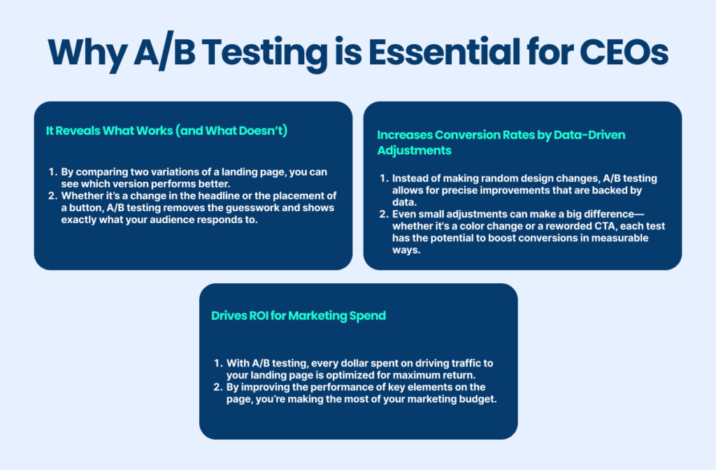
5. A/B Testing: The CEO’s Secret to Smart Decision-Making

How A/B Testing Drives Higher Conversions
When it comes to landing page success, A/B testing is the ultimate tool in a CEO’s decision-making arsenal. Imagine having the ability to test two versions of the same page and immediately discover which one captures more leads, clicks, or sales.
That’s exactly what A/B testing can offer, and for business leaders, it’s a method that takes the guesswork out of optimizing conversions. Think of it as a scientific approach to fine-tuning your landing pages—one element at a time.
With every tweak and adjustment, A/B testing brings you closer to your audience’s preferences, providing clear data on what resonates best.
The Steps to Successful A/B Testing
To ensure A/B testing is as effective as possible, follow these steps to get the results that matter.
- Set Clear Goals for Each Test
Define what success looks like for each element you’re testing. Whether it’s more button clicks, higher lead generation, or improved time on the page, having a clear goal ensures you’re measuring the right metrics.
- Test Only One Variable at a Time
It’s tempting to make multiple changes at once, but testing one variable at a time will give you a clear understanding of which specific change affected performance.
- Use Data to Inform Your Hypotheses
Review analytics before each test to identify the areas needing improvement. For example, test elements above the fold, like the headline or hero image, if analytics show a high bounce rate.
- Run Tests Long Enough for Accurate Results
Give each variation enough time to gather data. Running a test for too short a period can lead to misleading results. For example, if your landing page traffic varies by time of day or week, ensure your test covers a sufficient span.
- Analyze, Implement, and Repeat
Once your test is complete, analyze the data and implement the winning variation. Remember, A/B testing is a continuous process. Repeating these steps regularly allows you to refine your landing page based on the latest data.
6. AI-Enhanced Landing Pages: Is Artificial Intelligence Your Next Best Tool?
Artificial Intelligence (AI) is no longer a distant dream—it’s here, and it’s making significant waves in marketing and landing page optimization.
Source: Forbes
If you’re a CEO or business owner looking to stay competitive, incorporating AI into your landing page strategy might just be your next big move. AI has the power to analyze user behavior, predict patterns, and help you make strategic content decisions that connect with visitors on a personal level.
AI Insights That Predict User Behavior
One of AI’s biggest strengths is its ability to predict visitor behavior. Through data collection and analysis, AI tools can recognize user patterns, such as how long someone spends on a page, what links they’re likely to click, and even their interests based on browsing history.
These insights allow your team to adjust content in real-time, tailoring the page experience to each user’s preferences. Imagine a landing page that knows what a visitor wants to see before they even know themselves.
- Behavioral Targeting: AI-driven platforms can identify patterns, such as products frequently viewed together, and suggest them to visitors, mimicking the experience of a personalized recommendation. This is more than just adding suggestions; it’s about enhancing the overall user experience and making the landing page feel uniquely relevant to each visitor.
- Content Optimization on Autopilot: AI tools can automatically analyze which parts of your page are working and which aren’t. This means your team can focus on the creative and strategic aspects while AI takes care of testing headlines, adjusting layouts, and even creating custom CTAs based on audience data.
7. Personalization That Speaks Directly to Your Audience
In an age where customers expect a tailored experience, personalization is not just one of the landing page trends—it’s a necessity.
Think of personalization as the difference between greeting a visitor with a generic “Welcome!” and saying, “Welcome back, Sarah! Check out our new arrivals we think you’ll love.” One feels like a real conversation; the other, a distant shout.
Source: Azarian Growth Agency
Dynamic Text and Content That Adapts to Each Visitor
When content is personalized to address a visitor’s specific needs or preferences, it increases the chances of engagement and, ultimately, conversion.
Dynamic text replacement (DTR) allows your landing page to adjust its messaging based on various visitor data points—think location, industry, job title, or even referring source.
- Example of Dynamic Text: A SaaS company targeting small business owners could use dynamic text to adjust the headline from “Solutions for Businesses” to “Solutions for Small Business Owners.”
- Segmented Messaging: Imagine that a first-time visitor sees an introductory message about your brand while a returning customer sees a special discount or offer. This approach creates a tailored experience that speaks directly to the needs and expectations of each user.
8. Speed Matters: How Loading Time Impacts Your Conversions
In today’s fast-paced digital world, speed is a defining factor in the success of your landing page.
Research shows that nearly 40% of users abandon a page that takes more than 3 seconds to load. If your landing page is slow, you risk losing nearly half your potential customers before they even see your content.
Source: Wp-rocket
Why Speed is a Make-or-Break Factor
A fast-loading landing page doesn’t just improve user experience—it can dramatically improve conversion rates. Visitors have limited time and countless options; if your page doesn’t load quickly, they will likely leave and go to a competitor’s site. Here’s why CEOs should prioritize speed:
- Improves User Satisfaction: Users expect a smooth, instant experience. Slow pages frustrate visitors, and frustration doesn’t lead to conversions.
- Impacts SEO: Google ranks fast-loading pages higher, which can increase your landing page’s visibility in search results.
9. Show, Don’t Tell: Harnessing Video for Higher Engagement
Using Video to Drive Key Points Home
Imagine explaining your product or service in mere seconds—this is the power of video.
Visual content can take your landing page from “good” to “great” by capturing attention, building understanding, and establishing a deeper connection with visitors.
Source: HubSpot
Why Video Works
- Visual Learning: Most people process visuals faster than text, and a short video can communicate your offer in seconds.
- Emotional Engagement: Video lets you showcase the people, products, or services behind the brand. This human touch builds trust.
10. Social Proof That Builds Instant Trust (With Stats to Back It Up)
The Influence of Customer Reviews and Testimonials
In today’s marketplace, social proof is essential. People trust recommendations from others, especially when they’re making a buying decision.
Social proof is not just a “nice-to-have”—it’s a proven way to build credibility and inspire confidence. According to BrightLocal, 91% of people read online reviews before making a purchase.
Source: HubSpot
Building Trust with Social Proof
- Placement: Highlight testimonials near your CTA to reduce decision friction.
- Credibility Tags: Use badges from review platforms, awards, or certifications to strengthen trust.
- Quantify Success: Statistics like “Over 5,000 satisfied clients” make your impact more tangible.
Remember, potential customers want to see that others have trusted you first.
11. Creating Urgency and FOMO (Without Overdoing It)
Crafting Limited-Time Offers and Countdown Timers
The fear of missing out (FOMO) is a powerful motivator.
When done right, creating urgency nudges visitors toward action.
For CEOs, this tactic can convert hesitant visitors into buyers by subtly pressing on the urgency button. But there’s an art to it; overuse can cause skepticism.
Why Urgency Works
Urgency taps into a basic psychological principle—scarcity. When something is only available for a limited time, people are more likely to want it.
How to Build Genuine Urgency
- Countdown Timers: Use them for flash sales or limited offers. A ticking timer triggers the “act now” response, giving users a visual cue that they have limited time to act.
- Limited Quantity Alerts: Showing “Only 3 left in stock” can prompt action, especially if it’s a highly desirable item.
- Seasonal Promotions: Align your urgency with seasonal events or holidays. This makes urgency feel more natural and less forced.
12. Continuous Feedback Loops: Optimize Based on Real User Insights
Using Heatmaps and Session Recordings to Improve Layouts
Landing page optimization isn’t a one-and-done process.
For CEOs looking to fine-tune their landing page’s performance, setting up continuous feedback loops is essential.
Tools like Hotjar and Crazy Egg allow you to watch how real users interact with your site, offering powerful insights into what’s working and what’s not.
What Heatmaps Reveal
- Clicks: See where visitors are most likely to click. If they’re clicking on elements that aren’t clickable, it may signal confusion.
- Scroll Depth: Understand how far down the page users scroll. If key content is being missed, you may need to bring it above the fold.
- Movement: Track mouse movement to see where users linger, which can highlight what captures their interest most.
Checklist: Transforming Your Landing Page into a Strategic Asset
This is a handy checklist to help you keep track of the essential optimizations for your landing page. Check off each tip as you go, and watch your conversions climb!
1. Focus on Clear Landing Page Optimization Goals
- Define specific objectives for your landing page, like lead generation or product sign-ups.
2. Simplify Your Design: Less is More
- Embrace a minimalist approach that highlights key information and avoids clutter.
3. Maximize ‘Above-the-Fold’ Space
- Ensure critical elements like your headline, CTA, and value proposition are immediately visible.
4. Compelling Headline That Speaks to Your Audience’s Needs
- Use concise, impactful language to engage visitors at first glance.
5. Streamline Navigation for a Smooth User Experience
- Limit distractions and keep the focus on the action you want users to take.
6. Add Social Proof to Build Trust
- Include testimonials, reviews, or customer logos to reinforce credibility.
7. Use AI Tools to Personalize Content
- Leverage AI insights to display relevant content that aligns with each visitor’s preferences.
8. Harness Video for Quick, Engaging Explanations
- Embed a short video to explain your product or service and capture interest faster.
9. Create Urgency with Limited-Time Offers
- Incorporate countdown timers or stock alerts to drive action.
10. Test Variations with A/B Testing
- Experiment with different layouts, headlines, and CTA placements to find what works best.
11. Optimize Load Speed for a Seamless Experience
- Ensure your page loads quickly to keep visitors from bouncing away.
12. Continuously Collect User Insights for Ongoing Improvements
- Use tools like heatmaps and session recordings to fine-tune based on real user interactions.
With this checklist, [A] Growth Agency aims to guide you in implementing the best practices and setting your landing page up for success. Keep optimizing and watch the results!
In case you have the assistance, you should have already known whom to apply.
Our experienced team awaits to master your strategies and move you to the next level of success.

