Is your landing page leaving money on the table?
For every $92 spent driving traffic to websites, only $1 goes toward improving conversions.
That’s right—most businesses funnel cash into ads but neglect the one place that actually seals the deal: their landing page.
Landing pages aren’t just digital door mats; they’re your 24/7 sales reps.
Done right, they don’t just grab clicks—they transform curiosity into conversions and browsers into buyers.
And if your landing page isn’t doing that, it’s time to rethink the design, content, and strategy behind it.
As trends in user psychology, AI-driven personalization, and mobile-first design take center stage, standing out requires more than basic aesthetics.
You need an expert Landing Page Agency—one that combines creativity, technical precision, and audience insight to craft pages that work as hard as you do.
Ready to unlock the secrets?
Let’s go through the 7 game-changing factors that elevate a landing page from good to absolutely unmissable.
What Attributes Describe a Good Landing Page Experience?
A well-optimized landing page can be the difference between a visitor bouncing and a conversion. But what exactly makes a landing page experience “good”?
Is it the design, the speed, the messaging, or something deeper, like how seamlessly it aligns with user intent?
While many factors contribute to success, the key lies in crafting a page that attracts visitors and guides them effortlessly toward taking action.
So, let’s see what the attributes are.
1. Relevance is Royalty: Speak to User Intent
Landing pages are like blind dates—you only have one chance to make the right impression.
But here’s the catch: unlike a date, where you can charm your way out of a mismatch, landing pages don’t get a second shot.
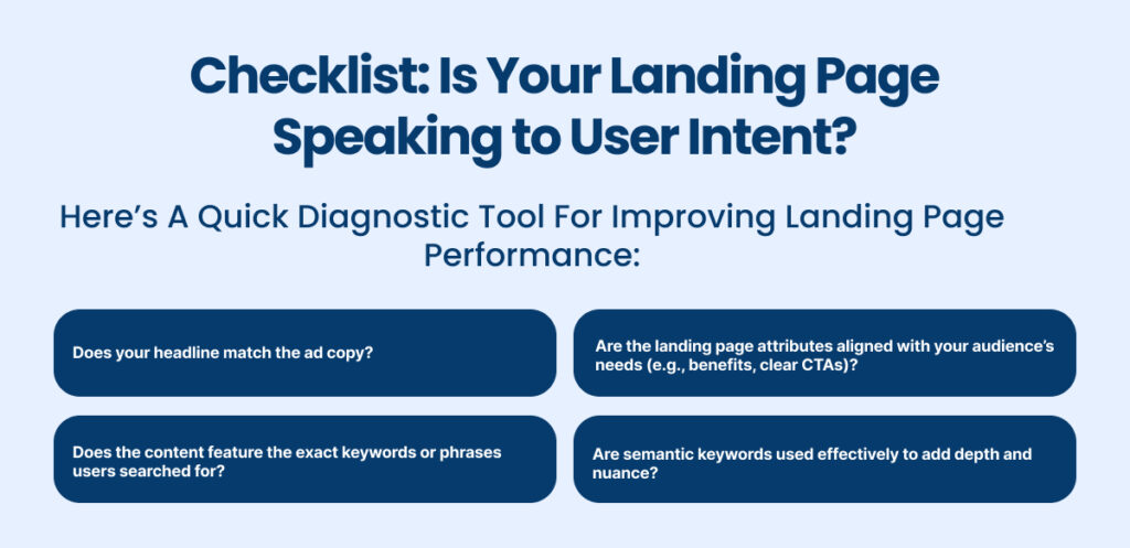
Alignment between ad copy, keywords, and landing page content is what guarantees your visitor’s expectations match the reality they land on.
So, which attributes describe a good landing page experience?
Relevance tops the list.
When your audience clicks an ad promising the best ergonomic office chair, they don’t want to end up on a general page about office supplies.
They want to see the chair you promised, along with pricing, features, and why it’s better than the rest.
The Magic of Semantic Keyword Optimization
Relevance goes beyond stuffing keywords into your landing page elements.
This is where semantic keyword optimization comes into play.
Instead of repeating the same keyword, it’s about using conceptually related terms to paint a complete picture.
If your b2b landing page is promoting “SaaS analytics software,” include variations like “cloud-based analytics tools” or “business intelligence dashboards.”
This approach improves your landing page SEO without sounding robotic.
Adding semantic keywords satisfies search engines and assures visitors that they’ve landed on the right page.
Hack: The SKAG Strategy for Laser-Focused Targeting
Enter the power player: Single Keyword Ad Groups (SKAGs).
Think of SKAGs as a direct matchmaker for search intent and landing pages.
Each ad group revolves around one specific keyword, making your message ultra-focused.
Here’s how it works:
- Group ads under a singular keyword like “cloud payroll software.”
- Link them to a product landing page solely focused on that keyword.
- Align headlines, copy, and call-to-actions with the specific search intent.
This boosts relevance and skyrockets your Quality Score, slashes CPC, and ensures users find what they need.

2. Turbocharged Load Times: Speed Wins the Race
Landing pages are your Formula 1 car, racing to convert leads into customers. In this high-stakes race, every millisecond counts.
Think about it—if your landing page design stalls for even a few seconds, your visitors are already hitting the back button, leaving your brand in the dust.
Actually, 53% of mobile users abandon a site that takes longer than 3 seconds to load.
For Google, this isn’t just a user experience issue; it’s a ranking factor.
Slow-loading landing pages frustrate visitors and hurt your visibility on search engines.
So, which attributes describe a good landing page experience? Speed is non-negotiable.
AMPing It Up: The Turbo Boost You Need
Enter Accelerated Mobile Pages (AMP), the turbocharger for mobile friendly landing pages.
AMP strips away unnecessary code to ensure your pages load at lightning speed, especially on mobile devices.

It’s like upgrading your F1 car to a model with better aerodynamics—streamlined, efficient, and built to win.
Why AMP Matters:
- Pages load almost instantly, reducing bounce rates.
- Improves landing page SEO, as Google prioritizes AMP-enabled pages in mobile search results.
- Optimized for speed without sacrificing essential landing page elements.
The Pit Crew: Tools to Optimize Load Times
Every second shaved off your load time is a victory lap. Here’s how you can optimize for speed:
| Tool/Method | Purpose | Example Application |
| Google PageSpeed Insights | Diagnose speed issues and get tailored tips. | Evaluate a b2b landing page performance. |
| Image Compression Tools | Reduce image size without quality loss. | Tools like TinyPNG optimize visuals on a product launch landing page. |
| Lazy Loading | Delays loading images until users scroll. | Perfect for media-heavy landing pages. |
| Reliable Hosting | Invest in servers optimized for speed. | A must-have for saas landing pages. |
Hack: Lightweight Design for Maximum Speed
Speed optimization doesn’t mean sacrificing aesthetics or usability.
Follow these landing page best practices:
- Use simple, clean layouts with minimal distractions.
- Compress and optimize visuals to load faster.
- Avoid heavy scripts or unnecessary widgets that bog down your site.
Speed is the First Impression
A fast product landing page is like a pit stop—quick, efficient, and focused on results.
Whether you’re targeting leads for a b2b landing page or rolling out a product launch landing page, speed ensures visitors stay engaged.
So, which attributes describe a good landing page experience?
Fast load times are your starting grid, ensuring you’re always ahead of the competition in the race to convert.
Optimize for speed, and you won’t just finish—you’ll win.
3. Mobile-First Magic: Thumb-Friendly Navigation
In a world where more than half of web traffic comes from mobile devices, designing for mobile isn’t a bonus—it’s the baseline.
If your landing page design doesn’t cater to mobile users, you’re effectively turning away half your potential audience.
So, which attributes describe a good landing page experience?
One key is ensuring your page is optimized for the way people actually interact on their phones—with their thumbs.
Features That Keep Thumbs Happy
Here’s how to build a mobile friendly landing page that makes every scroll count:
- Sticky CTAs: Keep your call-to-action buttons visible as users scroll. A floating “Sign Up Now” button ensures they don’t need to hunt for the next step.
- Responsive Layouts: Automatically adjust images, text, and forms to fit different screen sizes without compromising readability.
- Simple Navigation: Replace traditional menus with intuitive swipe gestures or anchor links to help users get around effortlessly.
- Concise Forms: Use single-step forms with large, easily tappable fields. Nobody wants to zoom in to fill out a name field.
Hack: Design for the Thumb Zone
Research shows that most mobile users interact with their phones using just one hand.
Focus your landing page attributes within the thumb zone—the natural area a thumb can reach without effort.
Place your CTAs, menus, and key information in this sweet spot for maximum engagement.
Why Mobile Optimization is Non-Negotiable
Mobile browsing dominates the digital landscape, with over 59% of global internet traffic originating from phones.
Source: Statista
If your landing page optimization doesn’t include mobile-first principles, you’re missing out on a massive audience.
Remember, a sleek b2b landing page on mobile can often decide whether a client follows up or bounces away.
By prioritizing mobile-first design, you ensure that your landing pages are as seamless and intuitive as a swipe on TikTok.
4. Trust, but Verify: Transparency Builds Bridges
Trust is the glue that holds the digital world together.
Transparency is one of the most crucial landing page attributes when it comes to conversions.
It turns hesitation into confidence and curiosity into action.
Key Ways to Build Trust
- The Yelp Factor: Social Proof That Sells
- Showcase authentic testimonials, ratings, and case studies.
- A glowing review on your SaaS landing page can speak louder than any headline.
- The Digital Handshake: Privacy Policies
- Display clear privacy terms and reassure users their data is safe.
- A visible privacy policy adds credibility, especially on a product landing page.
- The Transparency Checklist:
- Clear pricing with no hidden fees.
- Easily accessible contact information (click-to-call buttons are great!).
- Visual trust signals like SSL badges or logos of prominent clients.
Hack: The Thank-You Page Trust Hub
Want to take trust to the next level?
After a user converts, direct them to a “trust hub” on the thank-you page. This can include:
- Links to your FAQ section.
- Downloadable guides about your product or service.
- Testimonials or behind-the-scenes videos about your brand.
Why Transparency Matters
A lack of trust isn’t just a missed opportunity—it’s a dealbreaker.
For example, 81% of consumers say trust is a key factor in their purchasing decisions.
Whether you’re designing a product launch landing page or optimizing a landing page marketing campaign, building trust can be the difference between a bounce and a conversion.
Want to know which attributes describe a good landing page experience?
Start with trust—it’s the foundation of every lasting customer relationship.
5. CTAs That Demand Attention: Stop, Look, and Click
A call-to-action (CTA) is more than a button—it’s the compass that points your visitors toward conversion.
Without it, even the most stunning landing page design becomes a dead end.
But not just any CTA will do; it needs to grab attention, create urgency, and make taking action feel irresistible.
The Anatomy of an Irresistible CTA
A great CTA balances design and language to create an undeniable pull.
Here’s how to get it right:
- Be Action-Driven: Use strong, actionable verbs like “Start Now,” “Get Free Access,” or “Claim Your Discount.”
- Visual Contrast: Choose colors that pop but still fit within your brand’s palette. For example, a bright orange button on a navy blue background catches the eye while staying on-brand.
- Strategic Placement: Put CTAs where the visitor’s attention naturally flows—at the end of compelling sections or near high-value visuals.
Hack: Contrast with Purpose
CTAs that blend into the page are CTAs no one clicks.
Ensure your buttons contrast with the background but also complement the overall aesthetic.
For example, a bold red button on a monochrome SaaS landing page can scream “click me” without feeling out of place.
Brightly Lit Exit Signs: The Analogy That Sticks
Your visitors should know exactly what to do next without having to think twice.
Whether you’re working on a b2b landing page or a product launch landing page, a well-placed CTA can turn curiosity into action and action into results.
6. Personalization 2.0: Let AI Be Your Wingman
You walk into your favorite coffee shop, and the barista not only remembers your name but also starts making your go-to drink as soon as you step inside.
That’s the kind of personalized experience AI can bring to your landing pages.
AI as Your Conversion Concierge
With tools like Pathmonk Accelerate, personalization has gone beyond just adding a visitor’s name.
Source: Pathmonk
AI analyzes user behavior in real-time to tailor the landing page elements based on individual needs. For instance:
- If a user lingers on a specific product, the page might display an exclusive discount for that item.
- If they’re a returning visitor, the page can highlight previously viewed content.
This level of personalization feels intuitive and makes users feel seen and valued, boosting engagement and conversions.
Hack: Predictive Analytics for the Win
AI tools use predictive analytics to anticipate user actions.
For example, if someone pauses on pricing details, an AI-powered widget could pop up offering a live demo or a limited-time deal.
These subtle nudges can dramatically improve engagement on your mobile friendly landing page.
Why Personalization Matters
Visitors are bombarded with generic content every day.
By tailoring your landing page marketing to their specific needs and behaviors, you stand out.
Studies show personalized experiences can increase conversion rates by up to 20%.
From SaaS landing pages to product landing pages, AI-powered personalization isn’t just a nice-to-have—it’s a game-changer.
With AI as your wingman, your landing pages will serve up exactly what your audience needs, just when they need it.
7. Design for Delight: Keep It Clean, Clear, and Conversion-Focused
A clutter-free layout with intentional focus points can transform casual visitors into engaged users.
Simplicity isn’t boring—it’s strategic.
The Art of Minimalism: Prioritize What Matters
In the world of landing pages, less is often more.
By stripping away distractions and honing in on the essentials, you guide your visitors directly to what they need to see and do.
- Whitespace as a Canvas: Think of whitespace as the breathing room your content needs. It draws the eye to important landing page elements like headlines and CTAs, making the page feel professional and easy to navigate.
- Visual Hierarchy: Guide users through the page with bold headlines, subheadings, and strategically placed visuals. Make your CTA the star of the show.
- Declutter for Clarity: Remove unnecessary elements like excessive links, large blocks of text, or irrelevant visuals. Focus on one clear message and goal.
Hack: A/B Testing for Design Precision
Even the greatest artists refine their work, and so should you.
A/B testing allows you to experiment with layouts, color schemes, or CTA placements to see what resonates best.
For instance, test whether a sticky CTA at the top converts better than one placed at the bottom of your b2b landing page.
Simplicity Meets Speed
You simply do not have much time. Design your page as if your user has only 30 seconds to decide—it often feels that way.
To grab attention and drive action:
- Use bold imagery sparingly to tell a story.
- Limit distractions to keep users focused on your message.
- Ensure fast load times, especially for mobile friendly landing pages.
Why Design is the Silent Salesperson
The way your product landing page looks and feels can build trust, reduce bounce rates, and drive conversions.
Good design isn’t about being flashy—it’s about being functional and intuitive.
Take a cue from da Vinci: simplicity, balance, and focus are timeless, whether you’re crafting a masterpiece or designing a product launch landing page.
With these principles, your landing page won’t just look great—it will work great, too.
The Recipe for a Landing Page That Converts from [A] Growth Agency
A truly great landing page isn’t just a webpage—it’s a finely tuned machine, blending the art of storytelling, the science of user psychology, and the precision of modern technology.
Let’s recap which attributes describe a good landing page experience:
- Relevance ensures every visitor feels understood and directed to exactly what they need.
- Speed keeps users engaged by delivering content before they even think about bouncing.
- The mobile-first design ensures every thumb tap leads to action, not frustration.
- Trust signals build credibility and convert hesitation into confidence.
- Compelling CTAs guide user behavior with clarity and urgency.
- Personalization powered by AI transforms browsing into a bespoke experience.
- The clean, conversion-focused design turns simplicity into impact.
At [A] Growth Agency, we don’t just see landing pages as digital tools—we see them as opportunities to connect, engage, and convert.
Whether you’re looking to revamp your product launch landing page, optimize your b2b landing page, or design the ultimate SaaS landing page, our team combines creativity, strategy, and data-driven insights to craft landing pages that deliver measurable results.
Ready to transform your landing pages into conversion powerhouses?
Let’s make it happen together!
Partner with our ultimate landing page agency and watch your results take off.

